Sorry, we can't find that page!
You've tried to view a page that no longer exists.
Learn about reSolve's new look, head over to the homepage, or explore the links below.
If you need our help, don't hesitate to contact us.
You've landed on a page that doesn't exist anymore.
You've tried to view a page that no longer exists.
Learn about reSolve's new look, head over to the homepage, or explore the links below.
If you need our help, don't hesitate to contact us.
Explore our new mathematics sequences with integrated professional learning. Currently available for Foundation-Year 7, with more to come later this year.
Explore our collection of pedagogical tools which support you to implement the reSolve Approach in your classroom.
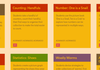
Browse and download our classic Foundation to Year 10 sequences, aligned with the Australian Curriculum V8.4.