Variability provides information about the consistency of data, while distribution refers to the patterns of similarity and difference in data. These patterns are important for making and evaluating predictions, making comparisons, and telling the story of data.
Students learn three key ideas about distributions: their features, how they are represented, and how they can be used to compare datasets. Distributions are described by their holistic features including their centre, spread, shape, clumps, gaps and atypical values. The median and mean are used to describe the centre of numerical data, while the mode (highest frequency) is usually reserved for describing categorical data. Graphical displays and numerical summaries are used to visualise, explore and describe distributions. Together, features and representations provide a powerful foundation for comparing distributions. Comparing distributions, along with prediction and managing variability, is one of statistics’ “superpowers”.
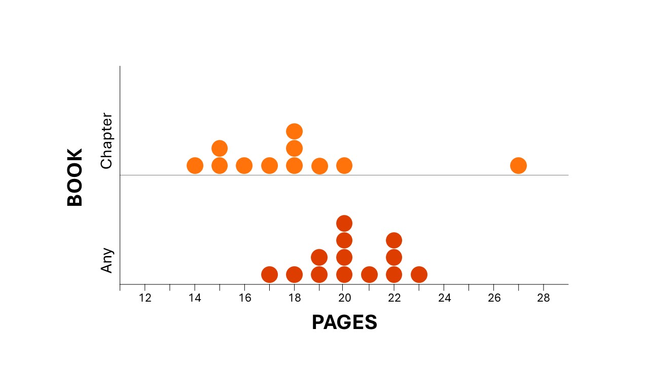
Students often focus on individual points in a distribution (such as the highest or lowest values in a dataset) rather than seeing the distribution as a holistic entity (aggregate) with particular characteristics. Just looking at the highest and lowest values can be misleading. Consider the graph below as an example. If a class were trying to compare the number of pages they could read in 30 minutes for a chapter book vs any other kind of book, they may look at the data in this graph and conclude that a chapter book is faster to read—because the student who read the most pages did so with a chapter book (27 pages in 30 mins). However, as a whole, there are other clues to consider. For example, in the distribution pictured here, the typical number of pages in the ‘Any Book’ group is higher than the typical number of pages in the ‘Chapter Book’ group. The distribution shows that there is an atypical value in the ‘Chapter Book’ group, which should lead students to wonder why. Was there an error? Were the pages skimmed rather than read? Did the book have few words on a page such as a graphic novel or picture book? This disposition of curiosity is a valued skill in statistics.
Our ability to interpret data is greatly strengthened by understanding its distribution. Each feature of a distribution needs to be learnt; however, the real value of these features is in using them together.

At a glance
- Variation shows the consistency of data, while distribution reveals overall patterns that are key for making predictions, comparisons, and interpreting data stories.
- Students learn to describe distributions by their features (centre, spread, shape, clumps, gaps, atypical values), represent them with graphs and summaries, and use these to compare datasets.
- Looking at the whole distribution rather than single points avoids misleading conclusions and encourages curiosity about unusual results.
In the early years, students are introduced to distribution with a range of representations, including drawings, images, lists, tallies, sorts and invented representations (inscriptions). They describe distributions by explaining their representations and indicating where there are more or fewer data points (frequencies).
For example, in a question such as “How tall is a typical Year 2 student?”, students may physically line up in height order. In doing so, they can visually identify who is the tallest in the class (if that height is atypical) and who in the class is of ‘typical’ height for their class (group in the middle). They might use that information to estimate (predict) the tallest and typical heights of the class next door and decide if their prediction is likely or unlikely. These ideas introduce them to thinking about data as a distribution.
Sorting categorical data provides a natural introduction to distributions in the early years. In organising or ordering numerical data, students from Year 1 can often visually identify where most of the data points are in a distribution, particularly as they develop representations that use a number line. This can be a great way to informally introduce the idea of using the centre (point or interval clump) to represent the whole dataset. Estimating the centre is valuable as it indicates where you expect future data to appear, linking centre to prediction.
Related sequences
Statistics: How many are we?
Students use everyday classroom experiences to investigate the story of their class data. They collect and record data about how many are in the class, and make informed predictions.
Statistics: How far goes my car?
Students make predictions, collect and record data about how a far a toy car might roll. They use the data they collect as evidence to refine subsequent predictions about their car.

Statistics: Climb, slide or swing?
Students investigate the problem of designing a class playground that is fun for everyone. They plan, collect, record and analyse survey data to conclude what playground features students would like.

At a glance
- Variation shows the consistency of data, while distribution reveals overall patterns that are key for making predictions, comparisons, and interpreting data stories.
- Students learn to describe distributions by their features (centre, spread, shape, clumps, gaps, atypical values), represent them with graphs and summaries, and use these to compare datasets.
- Looking at the whole distribution rather than single points avoids misleading conclusions and encourages curiosity about unusual results.
Students apply their experiences of creating and interpreting distributions to a broader range of problems. As they go through school, students learn more precise tools to describe or compare what they see visually. Interpretations of data in context are strengthened by learning new tools for describing the features of the data and exploring and expanding ways of representing data.
Comparing distributions is an important skill that students begin to learn in primary school. This supports them to notice relationships in multivariate data (multiple variables). Unlike comparing two numbers, comparing two distributions involves paying attention to multiple features of a distribution such as spread (including range), shape, gaps and atypical values; all of which can influence how data are interpreted.
Year 3 to Year 4
In Years 3 and 4, students are introduced to both standard and non-standard representations of data, including experimenting with the use of digital tools. They learn to describe benefits and limitations of different representations, particularly as they compare distributions. Therefore, maintaining a focus on the features of distributions and their representations is essential for helping students to understand how these tools support data interpretation and contribute to telling a meaningful data story. For example, if students forget to label a data display, focus on helping them to understand the purpose of the label (to interpret and communicate conclusions from data) rather than emphasising the label itself.
Year 5 to Year 6
In Years 5 and 6, students’ early skills in describing, representing and comparing distributions are extended and embedded into statistical investigations, focusing on the interpretation of the distributions in context and relationships students observe. Building on their work in Years 3 and 4 to compare benefits and limitations of different representations, students learn that they can choose representations that enhance the interpretations they are making from data. They expand their use of digital tools and are introduced to more sophisticated displays such as time series using line graphs and comparative displays. Students learn to critique representations in the media that may mislead readers.
By the end of primary school, students will have developed a strong foundation for exploring, creating, interpreting and applying distributions across a range of familiar contexts. This will set them up well for working with more complex and multivariate problems in secondary school.
Related sequences
Statistics: How far can we jump?
Students investigate how far they can jump. They define their question, plan to collect and record data. They analyse this data and use it as evidence to answer the question.

Statistics: Origami frogs
Students investigate how far an origami frog can jump. They define their question, plan, collect and record data. They analyse this data and use it as evidence to answer the question.

Statistics: Time to play
Students learn how to collect and analyse historical weather data, and use this data to make predictions about the best time to play outside at different times of the year.

Statistics: Loopy aeroplanes
Students make loopy aeroplanes using different designs. They collect, represent and analyse data to answer the question "Which loopy aeroplane design is best?”.

At a glance
- Variation shows the consistency of data, while distribution reveals overall patterns that are key for making predictions, comparisons, and interpreting data stories.
- Students learn to describe distributions by their features (centre, spread, shape, clumps, gaps, atypical values), represent them with graphs and summaries, and use these to compare datasets.
- Looking at the whole distribution rather than single points avoids misleading conclusions and encourages curiosity about unusual results.
The focus in secondary years is in expanding students’ repertoire of tools for describing, representing, and comparing distributions, particularly from multivariate data sets. Distributions become more central to students’ work with data as their skills in creating, interpreting and applying distributions are expanded.
Year 7 to Year 8
In Years 7 and 8, students deepen their understanding of distributions by comparing datasets in terms of centre, spread, and shape. They explore how these features vary across datasets and use this knowledge to make informed interpretations and draw contextually relevant conclusions. They are introduced to a new kind of distribution based on samples of data and explore its features. Students work more fluently with secondary data sources and apply their knowledge of features, representations and comparisons to interpret and draw conclusions from secondary data. They make connections between probability and statistics using their understanding of distributions of simulated data.
Year 9 to Year 10
In Years 9 and 10, students gain increasing autonomy to choose appropriate distributions for the context in which they are working. This allows them to critique with more confidence how distributions are interpreted by others, recognising that different features and representations may offer conflicting interpretations. Students at this age learn a range of powerful new bivariate representations (stacked box plots, scatterplots, two-way tables) and tools (association of variables) for comparing and interpreting multivariate relationships. They interpret how features of a distribution (spread, shape, outliers) affect the interpretation of data and choice of tools or representations. Their work in probability generates distributions of data from simulations, with estimated (empirical) probabilities compared to calculated (theoretical) probabilities.
By the end of secondary school, students’ facility for using features and representations of distributions allow them to solve more complex problems, anticipate distributions when planning statistical investigations, critically analyse distributions to consider multiple perspectives and recognise how some representations may bias interpretations that lead to a conclusion.
At a glance
- Variation shows the consistency of data, while distribution reveals overall patterns that are key for making predictions, comparisons, and interpreting data stories.
- Students learn to describe distributions by their features (centre, spread, shape, clumps, gaps, atypical values), represent them with graphs and summaries, and use these to compare datasets.
- Looking at the whole distribution rather than single points avoids misleading conclusions and encourages curiosity about unusual results.