Statistics: Time to play
View Sequence overviewThe data collected informs the form of representation used.
Whole class
Time to play PowerPoint
Each group
Access to computers or tablets
In this lesson, we use the Bureau of Meteorology website and Microsoft Excel to collect our data. We have included instructions on how to use the Bureau’s website and how to import data into Microsoft Excel. You may choose to use different tools, such as the ARPANSA website to access historical data on the UV Index, or CODAP (a free, online data analysis tool designed for students).
Lesson
Revise: We started this investigation on [the day that you completed Lesson 1, referred to for the rest of the lesson as "Monday"]. We are investigating what was the best time to play outside on [Monday] while we were at school.
Show students slide 4 of Time to play PowerPoint. Review the decisions made by the class on what data is needed, how this data will be collected, and how the data will be recorded. Remind students that they need to collect data for the day that the class completed Lesson 1 in this sequence, not the current day.
Show students how to access the data that they need on the Bureau of Meteorology website, and how this data can be imported into Excel. If you are using Excel, you can show students the short tutorial videos on slides 8 and 9 of Time to play PowerPoint, which explain how to access weather data on the Bureau’s website and how to import this data into Excel.
The Bureau holds a vast archive of weather observations, analyses and statistics.
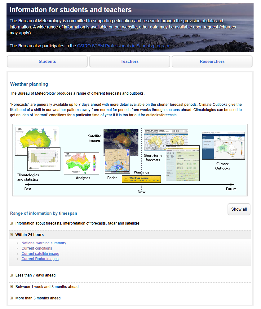
A section of the Bureau of Meteorology website is designed for teachers and students - https://reg.bom.gov.au/climate/data-services/education.shtml

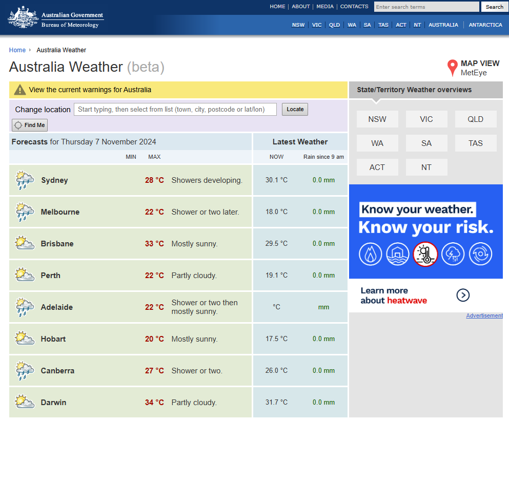
On this page you will find a section called “Weather planning”. Under the sub-heading “Within 24”, select “Current conditions”. Here you can search for the closest weather station to your school and access nearly 20 years of climate data.
This takes you to a new page - https://reg.bom.gov.au/places/
From this page you can search for the weather data for your specific location.

This video explains how to import data from a website into Excel.
This short video shows you how to access graphs on the Bureau of Meteorology website.
Revise: We are investigating what was the best time to play on [Monday]. We have our data, and we need to represent it in a way that clearly tells the story of the data.
Explain to the students that they need to decide the best way to represent their data to tell the story of the weather for [Monday]. Encourage students to look at the following two items to inform their decisions:
- A pop-up box displays when you hover over the different graphing buttons in Excel. The pop-up gives details of the representation and why you might choose to use that particular graph.
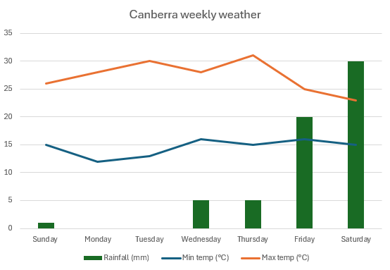
- Look at the different representations used by the Bureau of Meteorology on their website. Much of their information is represented in tables, with some temperature data represented as a line graph and rainfall represented as a column graph.
Ask the groups to organise and represent their data in a way that makes it easy to read and analyse. It is important that the data representation indicates how the weather element changed over the course of the day. In Excel, it is easy to change between data representations. You can encourage students to look at different representations to decide on which is most appropriate.
Representing data over time

Different forms of data require different types of representation and approaches of analysis. In this sequence, students collect data over time and so they need to use a representation that tells the story of how the weather changes over time.
Temperature: Line graphs are used to show how the temperature changes over time. Temperature graphs typically show maximum, minimum, and average temperatures.
Rainfall: Column graphs are used to represent categorical data; however, rainfall breaks this convention. Rainfall is typically represented as a column graph, even though it is recorded as continuous, numerical data. Rainfall and temperature for a given location are sometimes recorded on the same graph, and the two different representations make it easier to distinguish the data for each weather elements. The columns also allow for easy comparison across the months and also show how the rainfall changes over time.