Statistics: Time to play
View Sequence overviewData is used to inform our answers to questions.
Whole class
Time to play PowerPoint with the temperature graph for your local area inserted on slide 19
Each group
Computer access
Lesson
Explain: Data tells us a story. The data that you have gathered tells your group a story that will help you predict an answer to our question: What is the best time of day to play outside for each month of the year?.
Revise with students when they determined was the hottest part of the day. They will need to use this information and the data that they have collected to predict when the best time is to play outside for different months of the year.
Show students slide 18 of Time to play PowerPoint. This slide provides the following prompts and questions to guide students’ analysis of their data:
- Describe the shape of your data. How does the shape of your data help inform your predictions?
- Look at the range of the data, that is the warmest and coolest temperatures. How does the range of the data help inform your predictions?
- Is there data that seems surprising or different from the rest of the data? How might these observation impact your prediction/s?
Have each group analyse their data to determine the story that their data is telling. Ask the students to make a display which includes their data and their predictions for the best time to play outside for different months of the year.
Shape and range

Variation sits at the heart of statistics, and distribution is key to understanding variability.
When we consider distribution, we are looking at a dataset as a whole, rather than looking at individual data points in isolation. Examining a full dataset allows us to see patterns in the data.
In this activity, students examine how temperature varies across a year for their geographical location. They are specifically asked to look at the shape of the data and the range of data.
Shape of the data
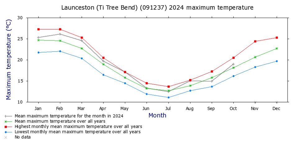
Typically, yearly temperature data in Australia follows a fairly symmetrical ‘U’ shape. The context of an investigation helps us account for and describe the shape of the data. In this instance the shape and symmetry of the data reflects the four seasons of the year.
Range of the data
‘Range’ is a measure of variability used in numerical data. In this case the range refers to the lowest and highest temperatures. The temperature range is dependent on the geographical location of a town or city. Often, coastal areas will have a smaller range in temperature across the year, compared to inland locations.
Gather students together for a class discussion. Show students slide 19 of Time to play PowerPoint. This slide currently has a graph showing the average monthly temperatures for Canberra. Replace this with the graph from your local area.
This short video shows how to access historical weather data from weather stations across the country.
Ask the students to share what they noticed about the data and the predictions that they made for the best time to play outside for the different months across the year.
Come to consensus as a class about the best time to play outside in the different months of the year. Explain to students that this is the story that the data is telling us. You might use the class conclusions to write a short narrative about the data and the best time to play outside.