Mathematical modelling: Cracking codes
View Sequence overviewData is used as evidence to inform predictions and decisions.
By analysing letter usage in text, we can determine the expected frequency of each letter.
The more high-quality data we include in our dataset, the more representative of the population our results become.
Whole class
Cracking codes PowerPoint
Frequency analysis Spreadsheet
Each group
Access to computers or tablets
Frequency analysis Spreadsheet
Lesson
Review the previous lesson, focusing on the similarities and differences between the frequency graphs created by each group, and the need for a larger dataset to get a more accurate indication of letter frequency.
Show students slide 5 of Cracking codes PowerPoint. Explain to the students that this slide shows the results of a 1982 manual analysis of letter usage in newspapers and novels, with a total sample of 100 362 alphabetic characters. Invite students to share some of their noticings.
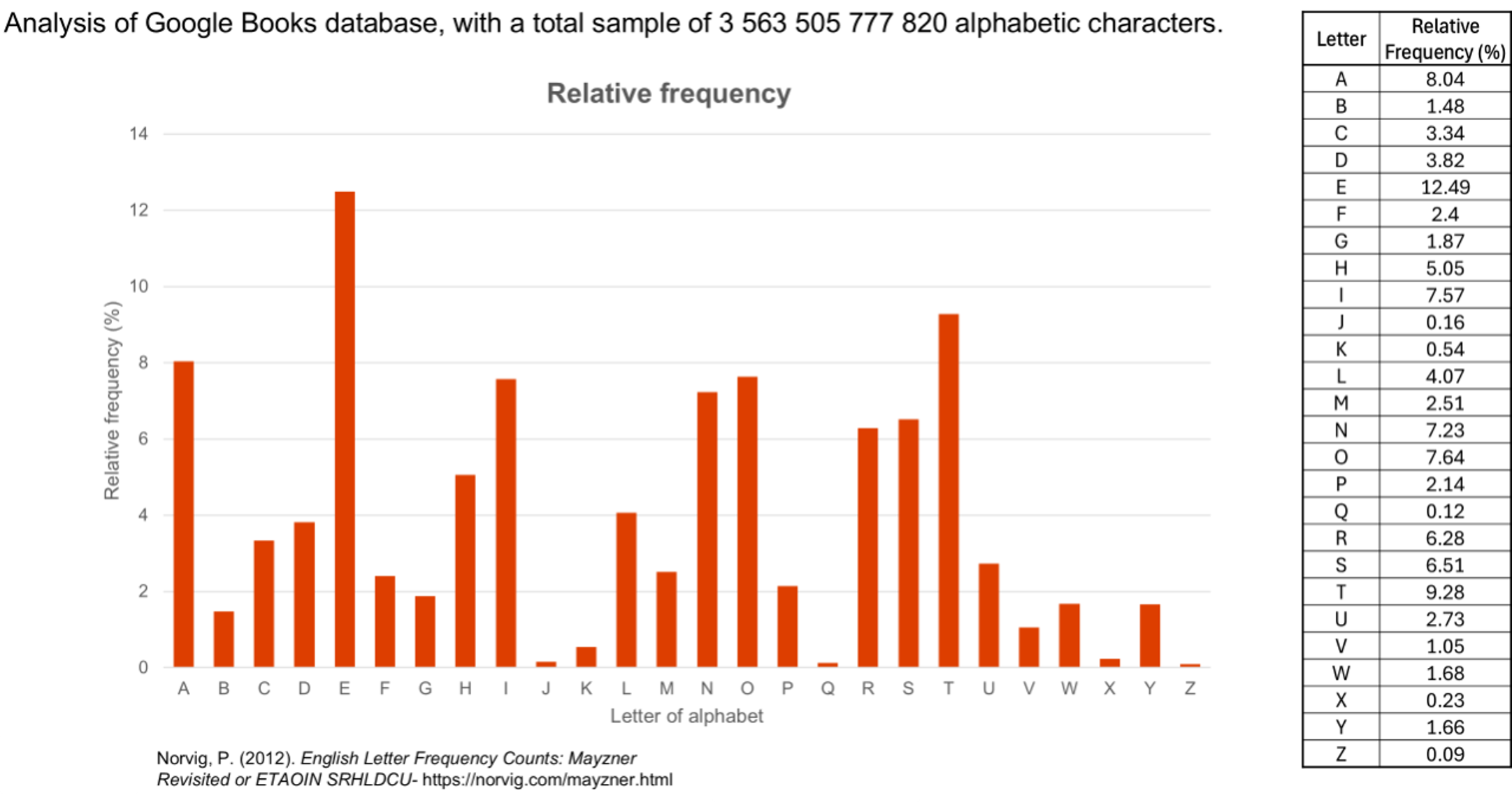
(Slide 6) Explain that this slide shows the results of a second analysis conducted in 2012. In this analysis, computers were used to analyse Google books, with a total sample of 3 563 505 777 820 alphabetic characters. Invite students to share some of their noticings.
(Slide 7) Make comparisons between the two sets of data.
Discuss:
- How are the two graphs similar?
- The shape of the two graphs is quite similar, indicating that the order and frequency of many letters are quite similar across both studies.
- How are the two graphs different?
- The are some interesting differences. Letters r, c and p appear more frequently in the second study with letters like h, w, and d appear less frequently.
- Why might account for the differences between the two analyses?
- The two studies analysed different genres of text at different points in time.
- Which study do you think shows the more 'typical' results? Why?
- The second study is more recent and analysed significantly more data. Interestingly it is the data from the first study that is seen much more frequently as the 'typical distribution'.
Typical distribution
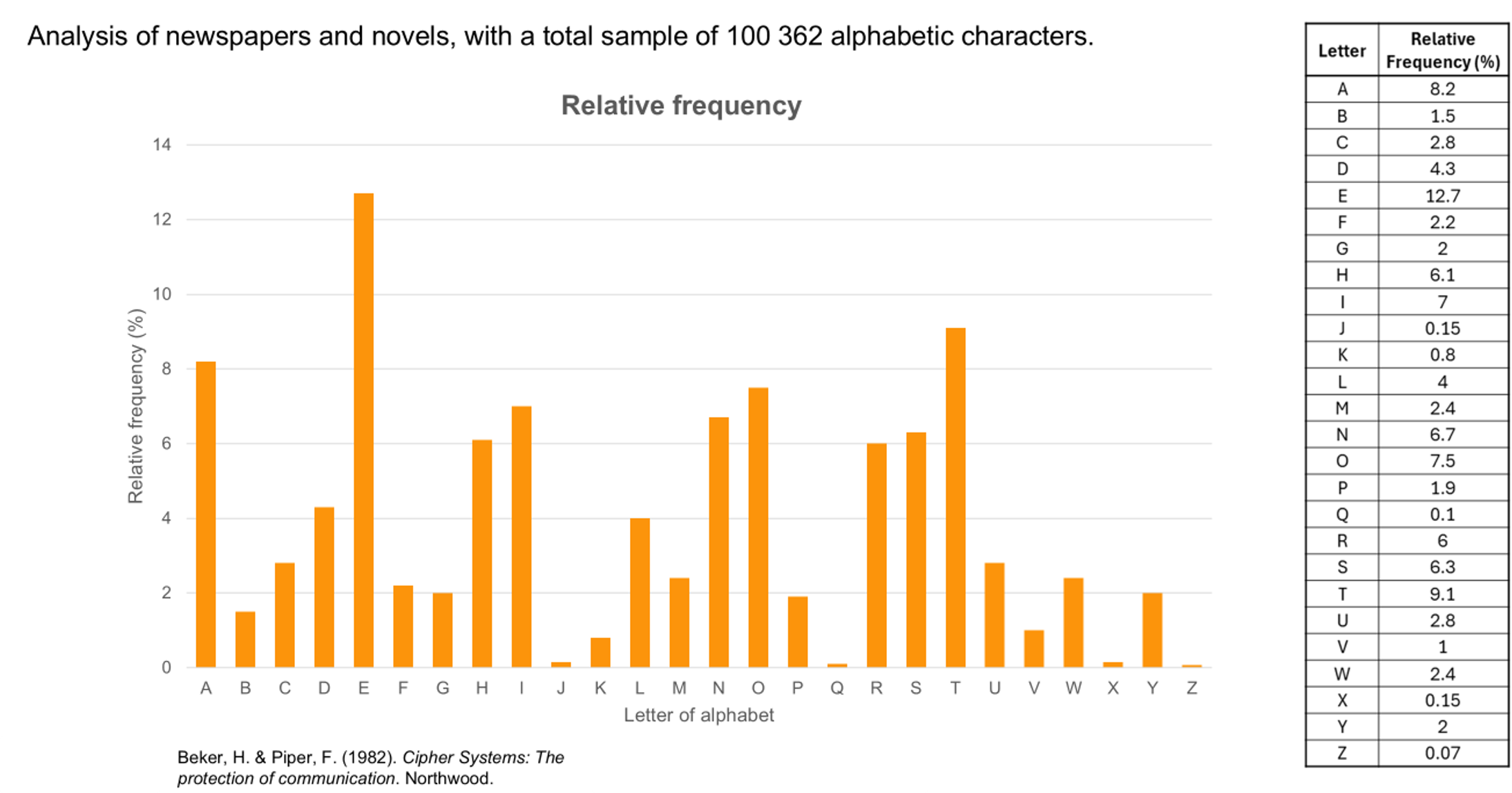
The top table and graph above show the typical distribution of letter in the English language. This is called a frequency analysis. This particular distribution was calculated by Beker and Piper in 1982.1 They analysed newspapers and novels, counting a total sample of 100 362 alphabetic characters. It is the results from this study that are used when referencing the frequency letters are used in the English language.
The bottom table and graph above show a more recent study conducted by Peter Norvig in 2012, when he was working as Director of Research at Google.2 In his study, Norvig used a computer to analyse texts from Google Books. A total sample of 3 563 505 777 820 alphabetic characters were counted in this study. This study is rarely referred to, despite being more recent and analysing a greater volume of data from varying genres. While the shape of the two frequency graphs are similar, there are some significant differences between the two studies.
Similar frequency analyses have been conducted for most languages.
In English, e is the most frequently occurring letter in the English alphabet, followed by t, a, and o. The letters j, x, q, and z are the least used letters.
1Beker, H., & Piper, F. (1982). Cipher Systems: The Protection of Communications. John Wiley and Sons.
2Norvig, P. (2012). English Letter Frequency Counts: Mayzner Revisited or ETAOIN SRHLDCU. <https://norvig.com/mayzner.html>
Have each group write a sentence with exactly 50 letters. (The sentence ‘Write a sentence with fifty letters total excluding spaces’ actually does contain exactly 50 letters!) They may need to revise it a few times to hit the target exactly.
Show students Slide 6 of the Cracking codes PowerPoint and explain that relative frequencies can be used to make predictions.
Discuss:
- Which letter do we expect to appear most often in a 50-letter sentence? About how many times do you predict it will occur?
- The letter E is predicted to occur about $12.5\% \times 50 \approx 6$ times
- About how many times would you expect each of the other vowels (A, I, O, U) to occur in a 50-letter sentence?
- A: about 4 times.
- I: about 3-4 times.
- O: about 4 times.
- U: about 1-2 times.
Now have students compare these predictions with their observed results from their own sentence.
Discuss:
- Why might the results differ from our predictions?
- Possible explanations could include the sentence content, small sample size, or word choice.
Provide students with access to the Frequency analysis Spreadsheet, which contains two sheets: Analysing text and Comparing frequencies. In this section of the lesson, the students will use the Analysing text sheet.
Students can type their 50-letter sentence in the text box, press Enter and observe the updated counts, relative frequencies and graph.
Set students a challenge to add a second sentence that produces a deliberate change in the relative frequencies (for example, reduce the relative frequency of the E to less than 12%).
The sheet also displays the results of the typical letter distribution in English from the previously mentioned studies for easy comparison. It is possible for students to code their own spreadsheets using the Frequency analysis Spreadsheet as a guide.
Have each group select some online text (e.g. a Wikipedia page on a topic of interest) and then use the Analysing text sheet to determine the frequency of letters in the selected passage of text. Ask students to calculate the relative frequency in the final column of the table.
Ask: Compare your analysis to the results of typical distribution of letters in the English language from the two studies we looked at earlier? What similarities and difference do you notice?
Ask students to add additional text to their spreadsheet by pasting passages of text, one after the other, into the relevant section of the spreadsheet. After each addition of new text, ask students to consider again the similarities and differences between the distribution of letters in their data, and the typical distribution of letters.
Discuss: What do you notice about the distribution of your data and the distribution of letters in the English language from the two studies we looked at earlier?
- Students should notice that as they added more text to their sample, the distribution of their data becomes increasingly similar to the typical distribution graphs. It is also likely that they will notice differences between their distribution and the typical distribution.
Spreadsheet software

In the previous lesson, students used computers to collate, organise and represent their data. Students will have had prior experiences of collecting, organising and representing data using pen and paper and it is useful for them to see how computers can do this work efficiently.
In this section of the lesson, we introduce a new spreadsheet tool. Students use a spreadsheet that automatically counts the number of times each letter of the alphabet appears in a given piece of text. We could have used this tool in the previous lesson, to save students from analysing text themselves. However, we chose to delay using this tool until now. Why?
It is important that students can experience the inefficiency of manually counting and recording so they can appreciate the importance of tools that can do this work efficiently. By doing this work themselves in the first instance allows students to build a better understanding of the work that a tool needs to do so they can select an appropriate tool and determine how they can use this tool effectively.
Combine all the class data together in the Comparing frequencies sheet by typing the total count of each letter from each group. The final column of the spreadsheet combines all counts for each letter to create an even larger dataset. It is possible to add columns to this chart if needed.
(slide 5) Ask: What do you notice about the distribution of our class data compare to the distribution of letters in the two large studies that we have looked at? Discuss the similarities and differences. Again, the greater volume of data should result in distribution more closely aligned to the typical distribution graph.