Mathematical modelling: Screentime footprint
View Sequence overviewLinear models can be used to predict future outcomes.
Mathematical models will always have limitations when used practically.
Whole class
Screentime footprint PowerPoint
Each group
Access to a computer or tablet and the Desmos interactive tool Digital download trends
Task
Show students slide 10 of Screentime footprint PowerPoint displaying the rate of CO2 emissions produced per gigabyte of data downloaded for video streaming. Explain that this value is an estimate only, as real-world emissions vary depending on factors such as the type of network connection and the efficiency of the data centres involved.
There is no single value for the CO2 emissions produced from downloading 1 GB of data. Different studies use different assumptions about network efficiency, data-centre operations, and the carbon intensity of electricity.
Two useful sources:
- Sphera (2022) estimates about 11 g CO2 per GB, based on measured energy use in data centres and networks combined with an average global grid emission factor.
- Sustainable Web Design (2023) – Models 0.07–0.12 kWh per GB using data-centre PUE and network energy use. With an average grid factor, this equates to 35–60 g CO2 per GB.
These variations show that CO2 emissions depend on factors such as network type, data-centre efficiency, and electricity sources. In this lesson, students use a mid-range estimate to support their modelling, focusing on how assumptions affect results rather than identifying a precise real-world value.
Discuss:
- What is a reasonable estimate to use for how much data one hour of high-definition (HD) video streaming requires, given a typical download range of 1.5GB to 3GB?
- Students may choose values like 2GB or 2.5GB as being towards the middle of the range, or calculate the average as $\frac{(1.5+3)}{2}=2.25\text{GB}$.
- They may select one of the extreme values if they always choose to download in low (1.5GB) or high (3GB) definition.
Ask students to estimate the number of hours that they spend streaming video and hence to approximate the amount of CO2 they produce in a week, a month and then a year, from streaming high-definition videos. For example, using the average of 47.5g of CO2 per 1GB of data downloaded, 6 hours of streaming a week would result in 6 hours×2 GB×47.5g of CO2=570g of CO2 emissions/week.
Invite students to share their results.
Show the students slide 11 of Screentime footprint PowerPoint, displaying the increasing number of gigabytes downloaded by the average premises in a month 2018-2025.
This table shows year-to-year data on how broadband usage in Australia has changed from 2018 to 2025. The figures have been taken from NBN Co and ACCC reporting, which provide consistent and systematic measures of average monthly data downloads per premises. These sources offer a dependable basis for analysing trends over time, showing a clear increase in household data use as streaming, cloud services, and the number of connected devices have grown.
NBN Co. (n.d.). Corporate information and reports. https://www.nbnco.com.au
Australian Competition and Consumer Commission. (n.d.). Telecommunications and internet reporting. https://www.accc.gov.au
Discuss:
- What do you notice? What do you wonder?
- Students might notice that data downloaded per premises has steadily increased over the years. Interestingly, there was not a significant increase in downloaded data during the COVID pandemic when many people were working and attending school from home.
- Students might discuss what is meant by ‘premises’ and how it might differ from household usage (includes residential and commercial premises).
- From what you see in the table, in what year do you predict that the data downloaded per premises will reach 850GB/month (approximately double the 2023 amount)? Why?
- Students may give a wide range of answers to this question, which is valid, given that they are being asked to predict an (unknown) future event. Encourage them to use the data provided as evidence for their predictions.
- From what you see in the table, what do you believe the monthly data download per premises will be in 10 years from now?
- The answer will vary depending on when the task is completed and on how students interpreted the growth in the previous question.
Demonstrate how to use the Desmos interactive Digital download trends to develop a linear model of the data downloaded per premises and obtain an improved prediction for:
- when data downloaded will reach 850GB/month.
- for the data downloaded per premises 10 years from now.
The Desmos interactive Digital download trends is designed so that a user can follow the steps on the screen to construct a linear graph that models the data in the table on slide 11 of Screentime footprint PowerPoint.
Instructions for students to follow appear at the top of the screen in blue.
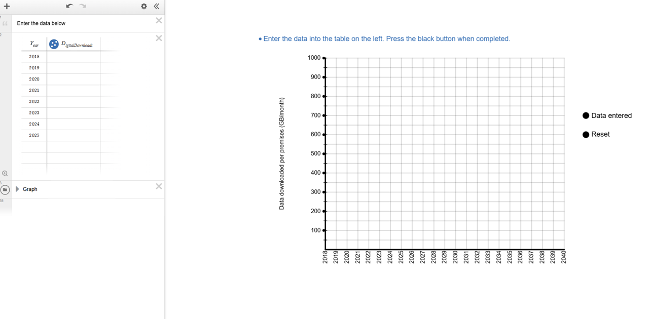
Students enter the data from slide 11 of Screentime footprint PowerPoint in the table on the left of the screen and then click the text on the right of the screen. A green and red point will appear along a green line.
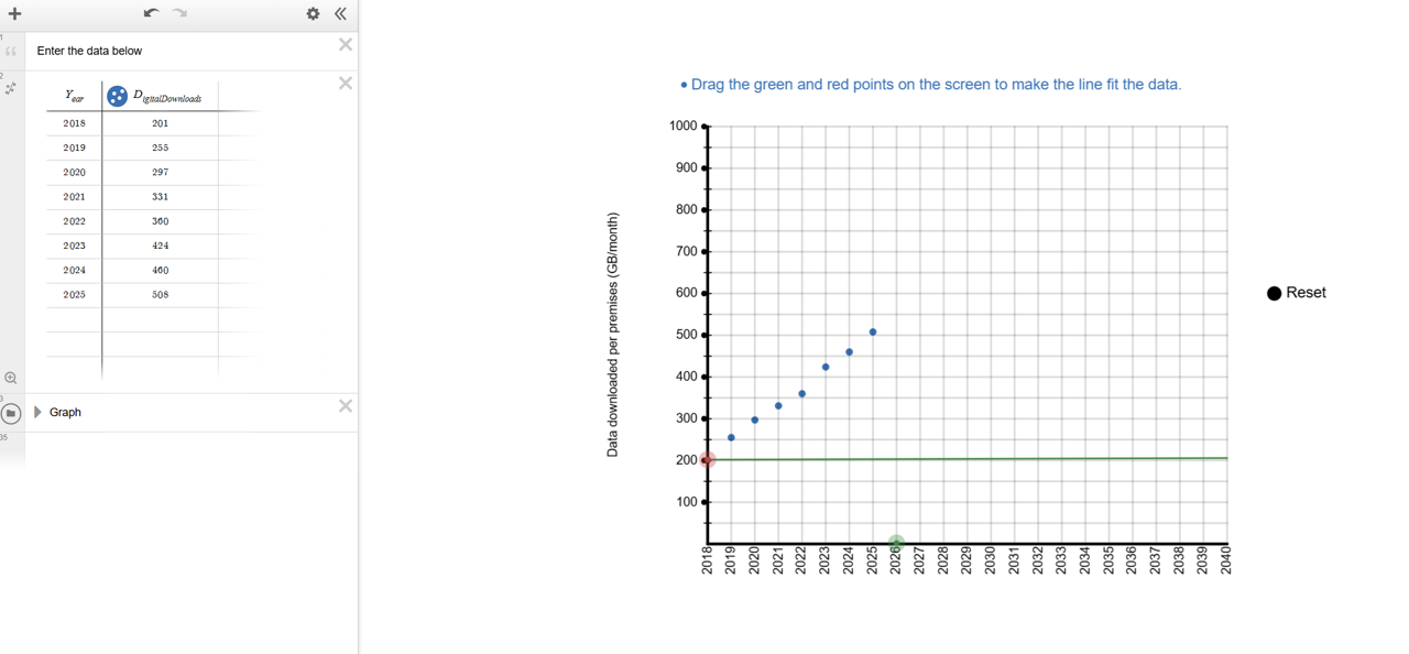
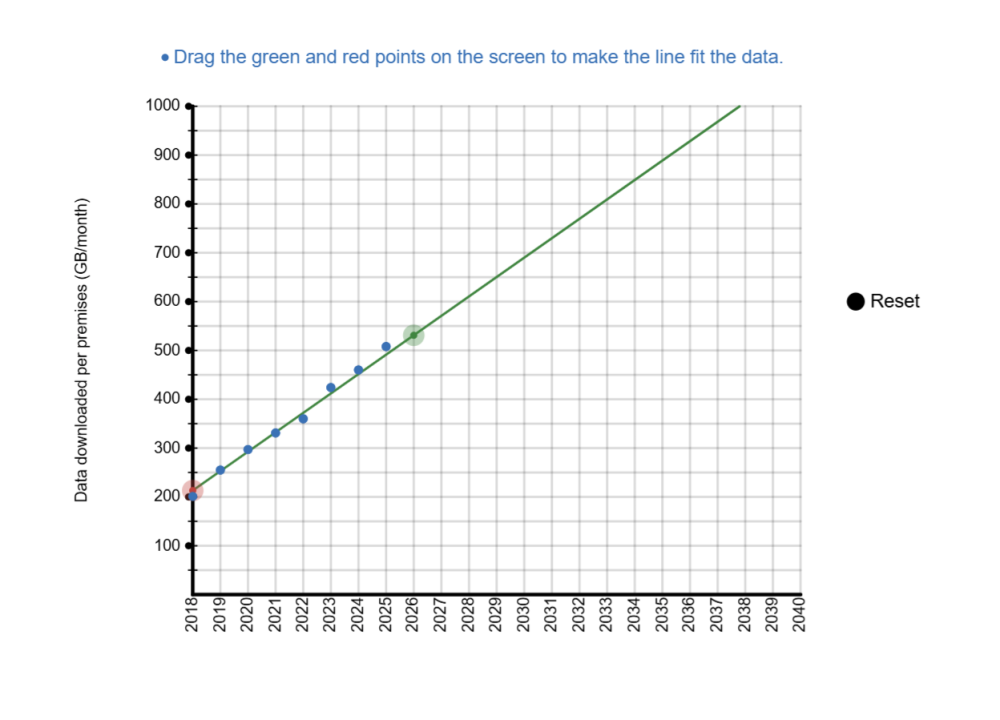
Students drag the green and red points to decide where the line should be placed to best fit the data.
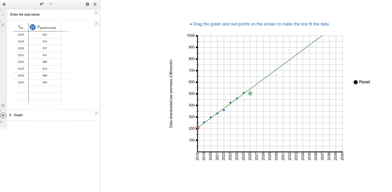
Organise students into groups. Ask them to open Digital download trends. They should follow the instructions to construct the graph and then use it to make accurate predictions about:
- the year in which the average data downloaded per month will reach 850GB per premises per month (approximately double the amount from 2023).
- the monthly digital download per premises per month 10 years from now.
Desmos graphing
Students need to be able to create graphs by hand using pen and paper, but digital graphing tools like Desmos can also add a powerful dimension to their learning. Rather than replacing manual graphing, they extend it. Desmos lets students move quickly from drawing axes and plotting points to exploring patterns, testing conjectures and visualising relationships. By making abstract concepts visible and interactive, Desmos opens new ways to understand mathematics. Pedagogically, Desmos encourages experimentation and sparks rich classroom discussion as students manipulate graphs, test ideas and see the effects of changes immediately.
Beyond the classroom, very few people sketch graphs by hand to analyse data or model relationships. Graphing and modelling are almost always done with digital tools. Complex functions, large datasets, and interactive modelling all demand computer support. Desmos enables students to tackle tasks that are slow, difficult, or even impossible by hand, while also streamlining common processes. For instance, sliders allow students to instantly see how changing parameters affects a graph, deepening understanding of gradients, intercepts, and transformations. This helps students make connections, test conjectures, and recognise the multiple “stories” a graph can tell.
How could I create this Desmos activity?
The graph used in this lesson is a pre-prepared, saved interactive that has been set up so that students are presented with easy to interpret steps, decisions to make and feedback on those decisions. There is no specific need for a student to have any experience with Desmos in order to successfully use this Desmos graph.
Alternatively, you or your students could create your own interactive, starting with a blank graph in Desmos, to achieve a similar outcome by following the steps below.
- Insert a table by clicking on the ‘+’ button in the top right corner of the screen.
- Input the data from the table on slide 11 of Screentime footprint PowerPoint.
- The problem with this data is that if we make the years our x-values, the data will appear 2018 points to the right of the y-axis. We can instead treat 2018 as ‘0 years’ and then measure time as the number of years after 2018, which gives us the numbers 1-9.
- In this system, 9 means 2027, because this is 9 years after 2018 when 2018 is 0 years. Additionally, x1=time and y1=digital downloads per month.
3. Zoom the screen (using the + and - buttons to the right) to until all the data points are visible on your screen. You can also change the scale by clicking on the wrench icon at the top right.
4. Finally, type in y1~mx1+c (Desmos is quite intuitive, so typing ‘y’ and then ‘1’ will automatically type a subscript 1). A line of best fit will appear on the axes, and the values of m and c will also appear.
How else could I use Desmos in the classroom?
In general, Desmos is a fantastic tool for students to interact with, to quickly create graphs of functions and relations, to enter and represent data easily, or to explore mathematical concepts dynamically via sliders. For example, the graph Investigating gradients and y-intercepts has been created with only a few lines of text. It allows students to easily vary the gradient and y-intercept of a linear graph.
Discuss with students where they chose to place the line and their answers to the two questions:
- In which year will the average data downloaded reach 850GB per premises per month (approximately double the amount from 2023)?
- What will be the monthly digital download per premises per month 10 years from now?
Select students to show their graph, identifying groups with significantly different answers. Ask groups to explain how they chose where to put their line. Example answers could include:
- going through the first and last point.
- going through as many points as possible.
- following the general flow of the points.
- trying to get the same number of points above and below the line.
Draw attention to the usefulness and limitations of a linear model, specifically:
- A linear model can be used effectively to make predictions about the future based on given data (for some data sets).
- Linear models are approximate, and may not be relevant beyond the data taken.
Linear models
A linear model is a straight line graph used to represent and approximate the relationship between two quantities. Practical applications from everyday life that follow a linear model can be causal, i.e. the size of one quantity literally decides the size of the other quantity, with no outside factors influencing either value.
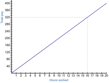
An example is the number of hours that a person works in an hourly-wage based job and the amount of pay they receive. If a person earns $20 per hour and works for 16 hours in a week, they will earn 16×$20=$320. An increase in hours would mean an equivalent increase in pay. If we let the number of hours worked equal H and the amount of pay equal P, then this situation follows the linear model P=20H, shown in the graph below.
When the relationship between two quantities seems to follow an approximate straight line, we can choose to represent the situation with a linear model.
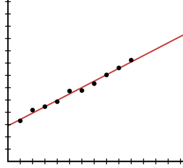
The data could be very close to a straight line shape as shown below.
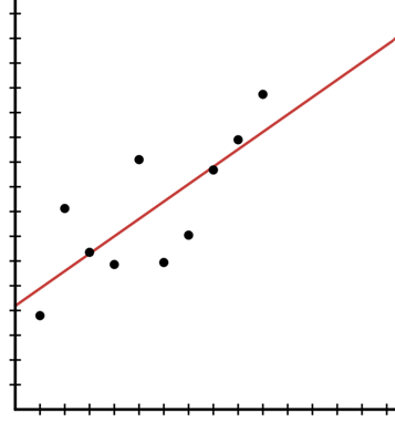
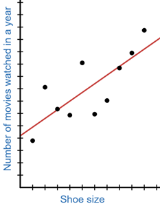
Alternatively, the data could be further spread out, but a straight line could be visualised, such as in the image below.
The key advantage of using a straight line graph to model these situations is that it is a simple model that can easily be used to make predictions, assuming that the data keeps increasing (or in some cases decreasing) at a constant rate.
The key disadvantage of using a straight line graph is that this simplicity can often overlook real-world complexities. The simpler we make the mathematics, the less it is able to model complex practical situations effectively. In the example image above, there could be many factors that could see the data begin to level off or increase at a much faster rate above the red line graph.
Hence, the choice to develop a linear graph to represent a practical application should be made based on some knowledge of the situation in addition to observation of the data. Three illustrative examples are given below:
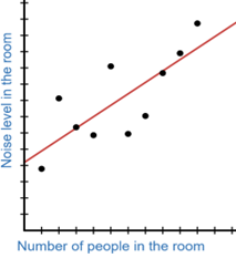
This data could continue to follow the line, as more people entering a room may increase the noise level in the room.
These seem unrelated and the linear shape is probably a coincidence. Therefore, using a linear model to represent this relationship might be a mistake.
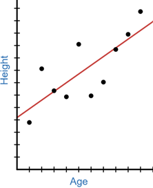
A linear, increasing relationship between age and height might make sense during a person’s childhood and teenage years, but we expect this increase to stop when people reach adulthood, meaning a linear model is only partially appropriate.
A linear model is a straight line graph used to represent and approximate the relationship between two quantities. Practical applications from everyday life that follow a linear model can be causal, i.e. the size of one quantity literally decides the size of the other quantity, with no outside factors influencing either value.
An example is the number of hours that a person works in an hourly-wage based job and the amount of pay they receive. If a person earns $20 per hour and works for 16 hours in a week, they will earn 16×$20=$320. An increase in hours would mean an equivalent increase in pay. If we let the number of hours worked equal H and the amount of pay equal P, then this situation follows the linear model P=20H, shown in the graph below.
When the relationship between two quantities seems to follow an approximate straight line, we can choose to represent the situation with a linear model.
The data could be very close to a straight line shape as shown below.
Alternatively, the data could be further spread out, but a straight line could be visualised, such as in the image below.
The key advantage of using a straight line graph to model these situations is that it is a simple model that can easily be used to make predictions, assuming that the data keeps increasing (or in some cases decreasing) at a constant rate.
The key disadvantage of using a straight line graph is that this simplicity can often overlook real-world complexities. The simpler we make the mathematics, the less it is able to model complex practical situations effectively. In the example image above, there could be many factors that could see the data begin to level off or increase at a much faster rate above the red line graph.
Hence, the choice to develop a linear graph to represent a practical application should be made based on some knowledge of the situation in addition to observation of the data. Three illustrative examples are given below:
This data could continue to follow the line, as more people entering a room may increase the noise level in the room.
These seem unrelated and the linear shape is probably a coincidence. Therefore, using a linear model to represent this relationship might be a mistake.
A linear, increasing relationship between age and height might make sense during a person’s childhood and teenage years, but we expect this increase to stop when people reach adulthood, meaning a linear model is only partially appropriate.
Show the students slide 12 of Screentime footprint PowerPoint, displaying the rate of CO2 emissions produced per gigabyte of data downloaded.
Ask students to calculate/predict CO2 emissions per premises per month for:
- 2023, using the table.
- the current year, using their model.
- what they think will happen 10 years from now, using their model.
Students should continue to work with the groups they have been working with to make predictions about the amount of digital downloads per premises per month, and the impact this will have on CO2 emissions. Challenge students to find numbers to support their conclusions.
An example prediction students could make in 2027 could be: in 2037, we predict that the average digital downloads per premises per month will have grown to over 900 GB, more than double the amount in 2023 (the end of the provided data). Therefore CO2 emissions caused by digital downloads would increase to double the amount, from 424×0.05=21.2 kg (where 1GB produces 50g of CO2) to around 900×0.05=45 kg.
Following the class discussion, allow students time to change their model if they would like to.