Mathematical modelling: Screentime footprint
View Sequence overviewData analysis can help identify major issues/trends to support effective decision-making.
Whole class
Screentime footprint PowerPoint
Access to Screentime footprint data Spreadsheet via a shared drive (as students need to load their data into this common spreadsheet)
Each group
Access to a computer or tablet
Each student
My digital CO₂ footprint Student sheet
Task
Show the students slide 20 from Screentime footprint PowerPoint. Explain that the table shows the approximate CO2 emissions by common activities, and that these values can change widely depending on factors such as the type of device being used, the quality of the video or audio stream, the efficiency of the data centres involved, and even the energy mix of the electricity grid that powers their device.
We have drawn on multiple sources to inform the emission values in this table. These sources include peer-reviewed or institutional research. Although we present a single figure for each activity, actual emissions vary with factors such as device, network type and electricity supply. In many reports, these values are provided as ranges rather than exact numbers.
| Activity | CO2 rate used in lesson | Reported CO2 rate | Source |
| Sending a text message | 0.015g/message | ≤0.02g/message | IEA, 2022 |
| Making a mobile phone call | 1.5g/min | ~1-2g/min | Carbon Trust, 2020 |
| Streaming TV/video (HD) | 55g/hr | ~55g/hr | Carbon Trust, 2021; Fraunhofer FOKUS, 2024 |
| Using GenAI | 2g/query | ~2.2g/query | Tomlinson et al., 2023 |
| Online gaming | 78g/hr | ~60-95g/hr | University of Bristol, 2022; IEA, 2022 |
| Listening to a podcast | 8g/hr | ~5-10g/hr | Shift Project, 2019; Obringer et al., 2022 |
| Playing a mobile game | 2g/10 mins | ~25-40g/hr | IEA, 2022 |
| Making a video call | 12g/10 mins | ~50-90 g/hr | IEA, 2022 |
| Scrolling social media | 2g/10 mins | ~1-3g/10 mins | Obringer et al., 2021 |
| Sending an email (no attachment) | 0.3g/email | ~0.2-0.4g/email | Berners-Lee, 2020 |
| Sending an email (with an attachment) | 35g/email | ~20-50g/email | Berners-Lee, 2020; IEA, 2022 |
| Streaming music | 10g/hr | ~8-12g/hr | Shift Project, 2019 |
References
Berners-Lee, M. (2020). How Bad Are Bananas? The Carbon Footprint of Everything (Rev. ed.). Profile Books.
Anderson, M., Flores, L. D., & Medina, M. K. (2023). Untangling the carbon complexities of the video gaming industry: A way forward [Report]. Playing for the Planet Alliance & The Carbon Trust. https://www.playing4theplanet.org/post/carbon-complexities-report
Carbon Trust. (2020). Mobile networks: Energy and carbon impacts. https://www.carbontrust.com/sites/default/files/documents/resource/public/Mobile%20Carbon%20Impact%20-%20REPORT.pdf
Carbon Trust. (2021). Carbon impact of video streaming. https://www.carbontrust.com/our-work-and-impact/guides-reports-and-tools/carbon-impact-of-video-streaming
Fraunhofer FOKUS. (2024). Green Streaming Whitepaper. https://www.fokus.fraunhofer.de/en/fame/news/whitepaper_green_streaming_24-10.html
International Energy Agency. (2022). Data centres and data transmission networks. https://www.iea.org/energy-system/buildings/data-centres-and-data-transmission-networks
Obringer, R., Rachunok, B., Maia-Silva, D., Arbabzadeh, M., Nateghi, R., & Madani, K. (2021). The overlooked environmental footprint of increasing Internet use. Resources, Conservation & Recycling, 167, 105389.
The Shift Project. (2019). Climate crisis: The unsustainable use of online video. https://theshiftproject.org/en/publications/unsustainable-use-online-video/
Tomlinson, B., Black, R. W., Patterson, D. J., & Torrance, A. W. (2023). The carbon emissions of writing and illustrating are lower for AI than for humans [Preprint]. Scientific Reports. https://doi.org/10.1038/s41598-024-54271-x
Provide students with My digital CO₂ footprint Student sheet. Ask students to calculate the digital CO2 footprint for a few of the example scenarios—Streaming TV/video and Using GenAI are good examples, as these include a time-based and activity-based calculation.
For some of the activities included in the table on slide 20 of Screentime footprint PowerPoint, the daily emission amount is quite simple to calculate.
For example, Using GenAI is listed as 2g per query. If I was to ask AI 6 questions in a day, then I would generate $6 \times 2 \text {g} = 12 \text {g}$ of CO2 in a day from using AI.
Some activities are more complicated. For example, Streaming TV/video is listed as generating 55g per hour. In the example scenario, the person streams video for 1 hour and 10 minutes in a day. There are a number of ways of representing this in hours, such as $1 \frac{1}{6}$ hours or $\frac{70}{60}$ hours.
Multiplying either of these by the rate 55g/hr will give the amount of CO2 produced: $\frac{70}{60} \times 55 = 1 \frac{1}{6} \times 55 = 64.17\text{g}$ of CO2.
Ask students to complete the first table of My digital CO2 footprint Student sheet by calculating the total CO2 produced by the example scenarios, and to rank the activities from 1 (produces the most emissions) to 12 (produces the least emissions).
Discuss:
- What do you notice? What surprises you?
- Invite students to share what they notice and what surprises them. For example, some may be surprised that mobile games have a low CO2 impact because many are played offline. This can prompt a useful class discussion about what drives emissions in digital activities.
- Do you think the values in the column "What if I did this in a day?" are reasonable for the example person?
- Streaming: 1 hour 10 minutes might seem low, but some people don’t have a streaming subscription and instead watch live TV.
- Texting: 85 texts per day is 5 texts per hour (assuming 8 hours of sleep), which seems a lot.
- Video calls: 50 minutes per day might seem very high, but if we include online business meetings it could be accurate as an overall average.
- Emails: 30 emails without attachments and 2 with attachments might seem high (particularly for Year 8 students), but might include spam email or marketing emails.
- Which activities have the highest rate of CO2 emissions?
- It’s hard to compare rates in different units—some rates are per hour, others per minute, others per text, email etc.
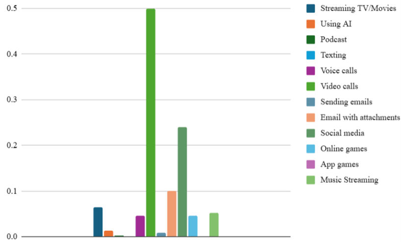
- The highest emissions are video calls (0.5kg), followed by scrolling social media (0.24kg).
Ask students to estimate the time they spend on each activity in this table and record their estimates in the second table of My digital CO2 footprint Student sheet. Students then calculate their total digital CO2 footprint, recording this in the second table, ranking their activities and reflecting on how their emissions might compare to the example person.
Provide students with access to Student CO2 emissions data Spreadsheet. To ensure anonymity, assign each student a letter from A to Z and then AA, AB, AC and AD (depending on the number of students). Ask students to enter their final data into the spreadsheet row marked with their letter.
Understanding assumptions in mathematical modelling

We produce mathematical models in order to understand and evaluate situations, compare performance, make predictions and inform decisions. This will usually require some level of assumption. Assumptions will be necessary in most mathematical models because we are trying to assign a numeric value to describe something complex.
For example, in this activity, we have used a CO2 emission rate of 55g per hour for streaming. The amount of CO2 emission caused by streaming is complex. Streaming requires significant electricity to power infrastructure, including data centres, content delivery networks, internet service provider networks and end user devices. Therefore, the type of device being used, the streaming service and what measures they have taken to reduce their CO2 production and the definition settings of device and the service alters the rate of CO2 emissions.
Given this complexity, we rely on reports with greater access to information about the nature of these services to generalise and simplify the rate of emissions. Unsurprisingly, reports suggest a wide range of possible rates of CO2 for streaming, from 3.6g per hour to 400g per hour.
Once we decide that we want a single number to represent our rate for the model we are using, we have many options of how to select that rate:
- review trusted sources of data
- select a number from the middle of the proposed range or find the average
- make an informed decision
We have chosen to use the commonly cited figure of 55g per hour which was cited in the 2021 Carbon Trust study.
Critically analysing secondary data

There are many sources of data available online and some are more reliable than others. Data such as this that has not been collected by the individual is called secondary data.
When working with secondary data, it is important to consider a few key questions:
- Who collected the data?
- Was it gathered by a reputable organisation, such a government body or a commercial company with a particular interest?
- How was the data collected?
- Was it based on a large, representative sample, or from a smaller group that may not reflect the wider population?
- When was the data collected?
- Older data may not capture recent changes in behaviours, especially in fast-moving areas like digital technology use.
- Why was the data collected?
- Understanding the purpose behind the data helps us recognise potential biases.
- Does the data stack up?
- If the data doesn’t make sense to us, this is a warning that perhaps the data is not reliable.
These considerations remind us that not all data is equally trustworthy or suitable for every purpose. As teachers, it is important to model for students how to question the reliability and relevance of the data they encounter. By encouraging students to be critical consumers of data, we help them develop essential skills for interpreting the statistics they meet in school, in the media and in their everyday lives.
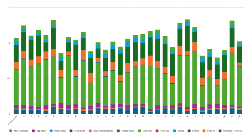
Display the Student CO2 emissions data Spreadsheet with all student data included and scroll to the right to display the stacked column graph.
Discuss:
- What do you notice about our class data?
- Depending on the data from the class, it is likely they will notice some colours are frequently larger than others.
- Discuss the distribution of data: the patterns of similarity and difference. For example, you might discuss which activities appear to be producing the largest amounts of emissions, the overall range of the data, the shape of the data and other features such as clumps, gaps and/or atypical values.
- Which activities are commonly producing the largest amounts of emissions?
- The colours that commonly take up the most space represent the largest amounts of emissions.
- What is helpful about this graph?
- It allows us to display a lot of data on one graph and to see the whole class at once.
- We can compare different people and identify the activities that generate a lot of CO2 emissions for many people.
- What is less helpful about this graph?
- Because it contains such a lot of data, it could be confusing and the data labels are quite small and hard to read.
- You can easily read the height of the first category (streaming) for each person, but you can’t easily read the heights of the other activities as they are stacked (not starting from zero) in each column.
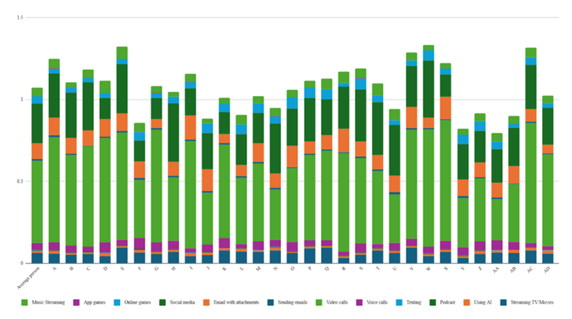
The image below shows an example of a stacked column graph that could represent a class.
Each vertical column represents a student. The height of the column represents the total amount of CO2 emissions produced by that person from the activities in the table. A higher column therefore means that more CO2 emissions have been produced. In this example, student E is producing the most CO2 emissions. Student F is producing the least.
The different colours in each column represent the amount of CO2 emissions that are being produced by each activity, with the key at the bottom. The large light green section in each column represents video calls, indicating that this activity generates a lot of CO2 for many people.
Choice of graph
When presenting data in a graphical display, it is important that we consider the purpose of the display. It is possible that we will want to convey a particular message. Alternatively, we may wish to analyse the data while it is in a particular display. Every different graph type has advantages and disadvantages and will be useful for different situations.
For the data in this activity, we want to compare student totals. We also want to look at the breakdown of the emissions from each activity by each student, and compare from one student to another.
We could choose to present the data as a standard column graph.
This is useful for comparing the student totals. A graph could also be produced to compare the CO2 emissions by activity for an individual student.
Another alternative would be to use a sector graph, which could display the breakdown of CO2 emissions by activity.
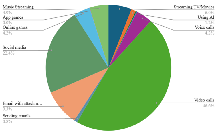
The disadvantage of this graph type, similar to the column graph above, is that we can examine a single student, but the total CO2 emissions of all students cannot compared and we need a graph per student to examine the breakdown of each person’s habits.
A stacked column graph is perfect for this situation.
It allows us to:
- compare the total heights to explore who is producing the most and least CO2 from use of digital tools.
- review how each individual student’s habits are broken down into the CO2 emission impact.
- identify trends across all students by looking at the coloured sections from one column to the next.
When presenting data in a graphical display, it is important that we consider the purpose of the display. It is possible that we will want to convey a particular message. Alternatively, we may wish to analyse the data while it is in a particular display. Every different graph type has advantages and disadvantages and will be useful for different situations.
For the data in this activity, we want to compare student totals. We also want to look at the breakdown of the emissions from each activity by each student, and compare from one student to another.
We could choose to present the data as a standard column graph.
This is useful for comparing the student totals. A graph could also be produced to compare the CO2 emissions by activity for an individual student.
Another alternative would be to use a sector graph, which could display the breakdown of CO2 emissions by activity.
The disadvantage of this graph type, similar to the column graph above, is that we can examine a single student, but the total CO2 emissions of all students cannot compared and we need a graph per student to examine the breakdown of each person’s habits.
A stacked column graph is perfect for this situation.
It allows us to:
- compare the total heights to explore who is producing the most and least CO2 from use of digital tools.
- review how each individual student’s habits are broken down into the CO2 emission impact.
- identify trends across all students by looking at the coloured sections from one column to the next.
Show slide 21 of Screentime footprint PowerPoint, which shows Australia’s estimated CO2 emissions data and population in 2024 used in Lesson 1. Remind students that these are estimates.
Ask students to calculate the rate of CO2 emissions per person per year (in kilograms), and then use this figure to determine the approximate proportion of their own annual CO2 emissions that could be attributed to their online activity.
The example person in the table produces 0.34kg/day of CO2 emissions from online activity, which equates to approximately 124kg/year.
In Australian, the total national emissions are approximately 380 million tonnes of CO₂ for a population of 27 million.
Per-person annual emissions:
380,000,000 tonnes/27,000,000 tonnes = 14.07 tonnes of CO₂/person/year
Proportion of emissions from online activity:
0.126 tonnes/14.07 tonnes = 0.009 = 0.9%
This means that online activity accounts for about 1% of this person’s annual CO2 emissions.
Discuss with students that our online activity represents a very small proportion of our total annual emissions. However, even small actions have measurable impact. Emphasise that taking simple, practical steps to reduce emissions (e.g. adjusting device settings, limiting unnecessary streaming, or choosing lower-impact options) can still contribute to meaningful change when adopted collectively.
Show the students slide 22 from Screentime footprint PowerPoint, displaying a table of the digital activities we have been considering. Lead a discussion asking students to propose methods for each strategy that could reduce the CO2 emissions from that activity. Some suggestions are included on the next slide.
Organise students into small groups and ask them to discuss which data saving initiatives they think would give the greatest CO2 emission reduction across the class. Students should consider:
- How likely is it that you (and others) would take the steps described?
- How prevalent is this activity within the group currently? Did this activity appear a lot in the stacked column graph?
- How much of the activity would be reduced by taking the steps described?
- What is the total CO2 reduction that you predict would occur per person?
Ask groups of students to produce a recommendation for the best way to reduce the CO2 emissions from this class, giving any numbers possible to support their recommendation.
To conclude the investigation, ask students to share their recommendations and any justifications they have produced to support their recommendation.