Mathematical modelling: Screentime footprint
View Sequence overviewLinear relationships are based on constant rates and can be described by equations.
Linear models can be used to predict future outcomes. These predictive claims goes beyond available data and so the must be expressed with uncertainty.
Whole class
Screentime footprint PowerPoint
Each group
Access to a computer or tablet and the Desmos interactive Graphing app sizes increase
Each student
Growing downloads Student sheet
Task
Show students slide 15 of Screentime footprint PowerPoint, which shows an iPhone 6 which was released back in 2014.
Ask:
- How does the iPhone 6 compare to current mobile phones?
- As our phones have changed, so have app sizes. How significantly do you think these changes have been?
Show slide 16 and explain that this table displays historical data on the size of various popular iOS apps (2015-2017). Explain to students that app sizes do vary by platform (for example Android and iOS) and this is data for iOS.
Pose the question: How have app sizes changed over time and how might this have affected CO2 emissions from phone usage?
Data sizes and prefixes

In the metric system, units of measurement have common prefixes that should be familiar from everyday life, such as milli, seen in a 375 millilitre drink can or kilo in a 1 kilogram bag of sugar. Because these prefixes have a consistent meaning across all types of measurement, students need only learn their meaning once and then can apply the same knowledge to length, mass and capacity. Each measurement has a standard unit—metres are the standard unit for length, grams for mass and litres for capacity. For each standard unit, the prefix milli has the same meaning: 1/1000 of a standard unit. Hence:
- 1 metre (m) = 1000 millimetres (mm)
- 1 gram (g) = 1000 milligrams (mg)
- 1 litre (L) = 1000 millilitres (mL)
Similarly the prefix kilo denotes 1000 standard units, hence:
- 1 kilometre (km) = 1000 m
- 1 kilogram (kg) = 1000 g
- 1 kilolitre (kL) = 1000 L
Other prefixes that we sometimes hear are mega, giga and tera. Using the example of litres:
- 1 megalitre (ML) = 1000 000 L
- 1 gigalitre (GL) = 1000 000 000 L
- 1 teralitre (TL) = 1000 000 000 000 L
In a practical setting, we use these prefixes to describe the amount of water in seas and oceans around the world. Sydney Harbour holds around 500 000 000 000 L of water or 500 GL.
Kati Thanda (Lake Eyre) is Australia's largest salt lake and holds approximately 12 600 000 000 000 000 L of water or 12 600 TL. Expressing these capacities in GL and TL give much simpler numbers to write and interpret.
Data is measured in a unit called bytes (B), but because data sizes are so large, the prefixes mega, giga and tera are often seen in Megabyte (MB), Gigabyte (GB) and Terabyte (TB). For example, file sizes might be measured in kB or MB, while the iPhone 17 is available in 256GB and 512GB versions. The relationships between these units of measurement is different to those used in the metric system:
- 1 kB = 1024 B
- 1 MB = 1024 KB = 1 048 576 B
- 1 GB = 1024 MB = 1048 576 KB = 1 073 741 824 B
- 1 TB = 1024 GB = 1048 576 MB = 1 073 741 824 KB = 1 099 511 627 776 B
These numbers may seem almost random, but they are more elegant when expressed using powers of 2:
1 KB = 210 B
1 MB = 210 KB = 220 B
1 GB = 210 MB = 220 KB = 230 B
1 TB = 210 GB = 220 MB = 230 KB = 240 B
Computers operate on a binary system which is base-2. The powers of 2 make it easier for computers to manage and calculate data capacities, rather than using the base-10 system used in the metric system for other units of measurement.
Organise students into small groups. Provide each group access to a device with internet and the Desmos interactive Graphing app size increase, and provide each student with Growing downloads Student sheet.
Either assign one app to each group, or allow groups to select an app to graph. Ask groups to complete Question 1 of Growing downloads Student sheet, graphing the increase of the size of the app over time, using the Desmos interactive Graphing app sizes increase. The Desmos graph will generate a linear equation which can be recorded on the Student sheet.
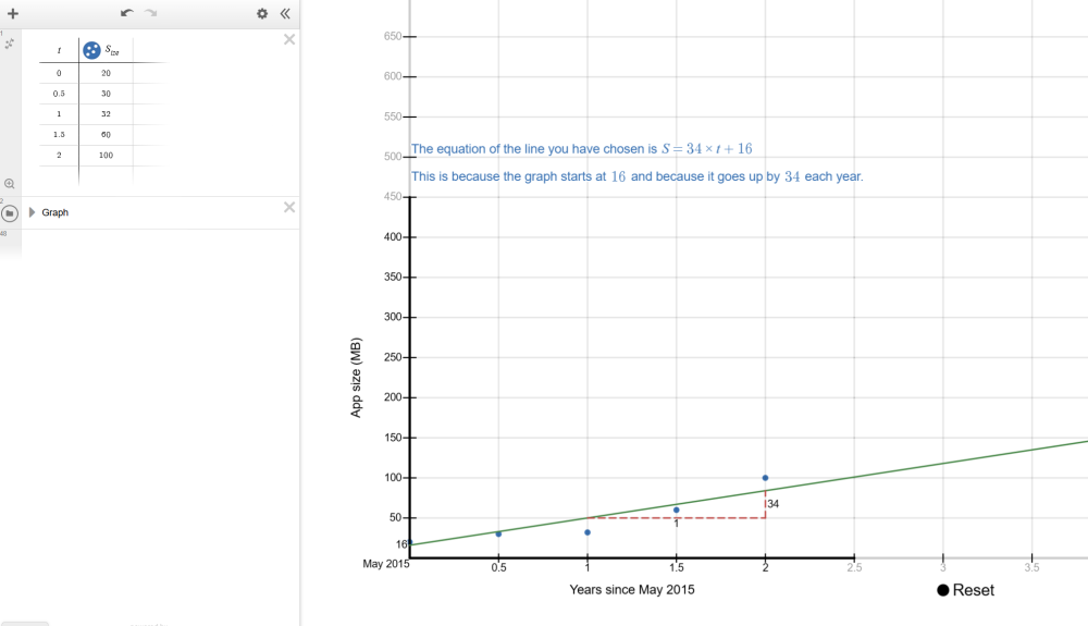
The Desmos interactive Graphing app sizes increase is designed so that a user can follow the steps on the screen to construct a linear graph that models one row of the data in the table on Growing downloads Student sheet. For this example, we will choose row 2, Instagram.
Instructions for students to follow appear at the top of the screen in blue.
Students enter the data from their selected row from Growing downloads Student sheet in the table on the left of the Desmos interactive screen.
t represents the time in years since May 2015. For example, when t=1.5, this is 1.5 years (or 18 months) after May 2015, which is November 2016. As the data is entered, it will display on the number plane. When all data is entered, students should click ‘Data entered’.
The next instruction asks students to drag two green points on the screen to move the line so that it roughly represents the data.
Once this is completed, students should press ‘Line chosen’. An equation will be displayed on their screen alongside an explanation of how the equation tells us the gradient and y-intercept of the graph. This equation defines the linear graph and allows us to find predicted file sizes (S) for a given time after May 2015 (t).
Discuss:
- Where did you start your graph?
- Students may choose to start their graph at the first point, or somewhere that allows a better line through the other points.
- Some may not realise that the y-intercept can be moved, so this is worth highlighting.
- How did you choose where to place your linear graph?
- Making the line go through the first and last point, ensuring the number of points above and below the line are equal, or trying to go through as many points as possible.
- What was difficult about choosing where to place your linear graph?
- It is impossible to make the line go through all of the points. The points also are unlikely to make a nice straight line and instead curve upwards.
Explain the meaning of the linear equation generated by the Desmos interactive and that it describes how S (app size) and t (time in years after May 2015) are related for any possible app size and time. Using the equation to find known values (e.g. size after 1 year) may give you a different value to the actual data, because the linear graph does not perfectly fit the underlying data.
The Desmos interactive generates and presents a linear equation that matches the line chosen by the students. In the example presented in the previous step, the interactive generated the equation $S=34 \times t+16$.
This equation represents every point on the line. If we choose any time, for example $t=3$ which is May 2018 (3 years after May 2015), we substitute $t=3$ into the equation $S=34 \times t+16$.
$S= 34 \times (3)+16 $
$=102+16$
$=118$
This means that 3 years after May 2015, the predicted size of the app is 121 MB.
Ask students to use the equation to make predictions about the current and future sizes of the app they are studying (e.g. in 2027, a student would find the predicted size of the app in 2027 and 2037). Students can check their predictions by checking the iOS store to find the current size of the app they are researching.
Using historical data to evaluate models
In this lesson, students use historical data from 2015-2017 to develop linear models to make predictions for the future.
A statistical prediction involves three key elements: making a claim about the unknown, using data as evidence to justify the claim, and articulating the uncertainty inherent in the prediction.
How do these elements look in our lesson?
- Making a claim about the unknown: Students use their linear model to predict future app sizes.
- Using data as evidence to justify the claim: The model itself justifies the prediction as it is based on historical data. We want students to be able to articulate this, as the goal is for students themselves to be able to use the data to justify their prediction.
- Articulating the uncertainty inherent in prediction: Any prediction about the future is inherently uncertain as it is making predictive claims beyond the available data.
In this lesson, students develop their predictions using a straight-line (linear) model based on historical data. It is important to emphasise that when students check their predictions and discover they are not correct, this does not mean their original equations were wrong. Instead, it highlights that the linear model they created may not be well-suited to the data. This provides an opportunity to deepen students’ understanding of the uncertainty involved in prediction and the role models play in representing data.
In this lesson we deliberately use older historical data (from 2015-2017). This allows students to make “future” predictions about our current time and then test the accuracy of their predictions by comparing them with today’s app sizes. This process reinforces two key ideas: predictions are always uncertain and the suitability of the model has a significant impact on how well a prediction aligns with real-world data.
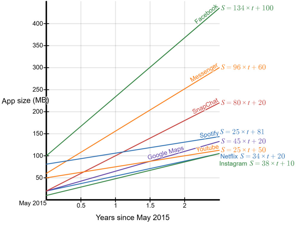
Lead a discussion where students present their findings to the rest of the class. Once students have shared their experiences, show the students slide 17 of Screentime footprint PowerPoint displaying graphs of the eight apps on the one screen.
Discuss:
- How do these equations compare with yours? Does a different equation mean you’re wrong?
- When modelling a data set there is not one ‘right answer’, but rather a range of graphs and equations that reasonably match the underlying data.
- What do you notice? What do you wonder?
- Students might notice that Facebook had the highest app size in May 2015, the highest app size in May 2017, and the highest rate of growth of any app. They may wonder why YouTube did not increase at a faster rate.
- Which app increased the fastest and how do we know?
- Facebook increased at the fastest rate, with an increase of approximately 135 MB per year. We can see this from the equation, which in our example was $S=134 \times t + 100 $.
- Interesting, since 2017 Facebook’s file size has only increased by a few MB. This is well below the predicted rate of growth based on the equation. You might discuss why the app has not changed much since 2017.
- How does the rate of increase in the graph relate to the equation?
- The bigger the number that is multiplying with t, the higher the rate of increase of the line. This the gradient and a higher gradient means a steeper line.
- Looking at your Desmos graphs, is a straight line appropriate for the data?
- Not for all the data. The data points curve upwards, so a linear model does not fit well.
- What happens when students use their linear equations to predict the current app size and compare it with the real size?
- They will see that their predictions are quite inaccurate. This isn’t because their equations are wrong—it’s because the apps’ growth is not linear. In reality, the growth appears to level off over time, meaning a different shaped graph. Ask students to explain the shape of a graph that would better for the data. For example, a curve that rises more steeply at first and then levels off.
Is a linear model always appropriate?

Students often assume that data should form a straight line, especially when they are introduced to linear modelling. However, real-world data rarely follows a perfectly linear pattern. Linear models are useful because they are simple, familiar, and easy for students to work with. This is why they are often introduced first when exploring relationships between variables.
It is important, though, to help students recognise the limitations of simplifying the mathematics. As we choose a simpler model—such as a straight line—it becomes less likely that the model will accurately reflect practical situations. This does not mean students’ equations or calculations are incorrect; rather, the model may not be suited to the data.
Supporting students to compare their linear predictions with actual values allows them to see where and why the model breaks down. This deepens their understanding of how mathematical models work, why predictions carry uncertainty, and why selecting an appropriate model is essential when interpreting data.