Mathematical modelling: What makes us happy?
View Sequence overviewExamining subsets of data can change what we notice about a relationship.
Comparing groups helps us understand whether patterns are consistent.
The context and size of a dataset affect how much we can trust our interpretations.
Each student
Access to a computer and the online data analysis tool CODAP (https://codap.concord.org/). Alternatively, students can work together in pairs with a shared computer.
What makes us happy? Spreadsheet
Task
Explain to students that they will use CODAP to create separate scatterplots and lines of best fit for each of the five continents (Africa, Americas, Asia, Europe, and Oceania), and then compare the relationships across continents.
Provide students with access to the What makes us happy? Spreadsheet and ask students to open the sheet titled 2023 continents. This data has been retrieved from the World Happiness Report.
Ask students to use the data to create five separate scatterplots, one for each continent, showing the relationship between GDP per capita (PPP) of each country and the Cantril Ladder score for 2023. For each scatterplot, students should add a line of best fit.
Before students compare the graphs, point out that CODAP automatically adjusts the scales on each scatterplot to suit the data. Explain that this means the axes may not be the same across continents, so patterns can appear more or less pronounced simply because of differences in scale. Emphasise that students should focus on features such as the overall direction of the relationship, the clustering of points around the line, and the consistency of the pattern, rather than the apparent steepness or spread alone.
Ask students to use each graph to make predictions, such as What would the predicted Cantril Ladder score be for a country with a GDP per capita (PPP) of $50 000 in this continent?” Students should make and compare predictions for each continent.
The examples below show separate scatterplots and lines of best fit for each continent, along with the predicted happiness score for a country with a GDP per capita (PPP) of $50 000. These examples are provided to support comparison across continents.
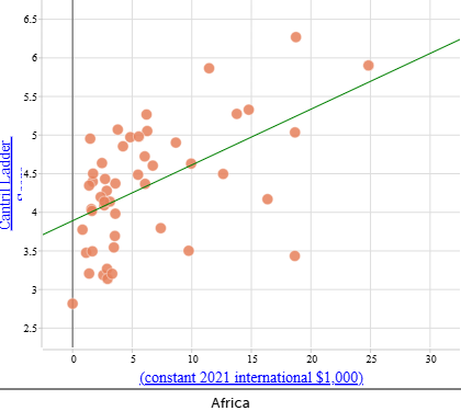 | Africa Cantril Ladder score: When $\text{GDP per capita (PPP)} = \$50\,000$: |
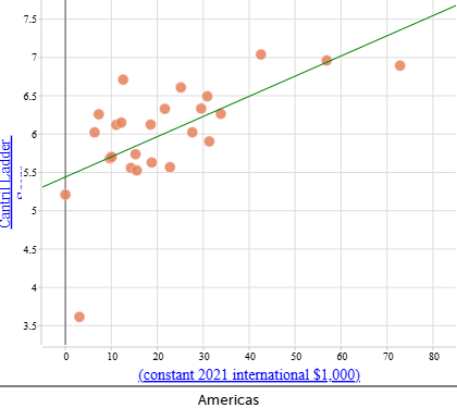 | Americas Cantril Ladder score: When $\text{GDP per capita (PPP)} = \$50\,000$: |
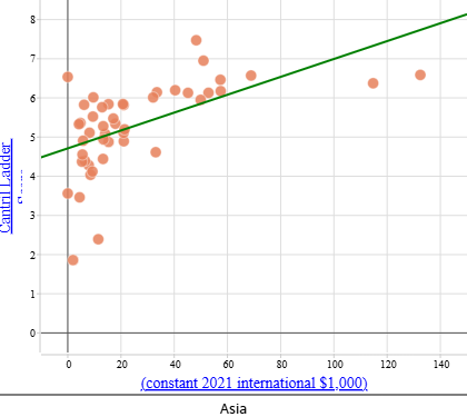 | Asia Cantril Ladder score: When $\text{GDP per capita (PPP)} = \$50\,000$: |
When comparing the scatterplots, some continents show a clearer relationship between GDP per capita (PPP) and Cantril Ladder score than others. In Europe (not shown above) and the Americas, the data points tend to cluster more closely around the line of best fit, suggesting a stronger and more consistent linear relationship. In contrast, Africa shows a much wider spread of points relative to the line, indicating a weaker relationship between wealth and happiness.
These differences can be identified by looking at how tightly the data points cluster around the line of best fit and how consistently the pattern is followed across the range of GDP per capita (PPP) values, rather than by relying on numerical measures.
Note that the scales on these scatterplots are automatically adjusted to suit each dataset. This means that care must be taken when comparing graphs across continents, as differences in scale (particularly for Asia, which has a wider range of happiness scores) can affect how patterns appear visually.
When you copy multiple datasets into CODAP, they are usually named the same way (‘clipboard data’), which can make it difficult to navigate.
Clicking on the title at the top of a table or graph allows you to edit the title and change the name to something more appropriate.
Watch the video below to see how you can distinguish between your datasets in CODAP.
Remind students that the sequence began with the question: Is there a relationship between the wealth of a country and its happiness rating? Explain that when a line of best fit is drawn for a subgroup of data, such as a continent, it is recalculated using only the data points in that subgroup.
Discuss:
- How does separating out the data for different continents help highlight important differences in relationships between GDP per capita (PPP) and the Cantril Ladder score?
- Separating the data helps make patterns easier to see compared to when countries are combined into a single scatterplot. This helps show that a single global model may oversimplify the relationship and that regional context matters when interpreting data and making predictions.
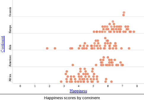
- What do you notice about the scatterplot for Oceania? What countries are included/excluded in the data? What does that mean in terms of how you can use these results to make predictions?
- The Oceania dataset contains only two countries, Australia and New Zealand, most likely because comparable data are not available for many Pacific Island nations. While it is possible to draw a line of best fit that passes perfectly through these two data points, this does not make the model reliable or meaningful. With so little data, there is insufficient evidence to draw conclusions about relationships across Oceania, particularly given that Australian and New Zealand differ substantially from many other countries in the region in terms of income and development.
- Do the scatterplots by continent show the same trends in correlation compared to the scatterplot for all nations? What does this mean in terms of our ability to make predictions?
- Like the scatterplot for all nations, all scatterplots by continent show a positive correlation, except Oceania, where the very small number of data points makes any assessment unreliable.
- The strength of correlation varies quite significantly by continent—strongest in Europe and the Americas and weaker in Asia and Africa.
- We can be more confident using the equations to make predictions for Europe and the Americas because the data show a clearer and more consistent linear pattern, and less confident for Asia and Africa where the relationship is weaker or more variable.
- Why might a regression model fitted to one content be a poor model for predicting happiness in another continent?
- Different continents show different patterns in the relationship between GDP and happiness. In some continents, countries with similar GDP levels have similar happiness scores, while in others they do not. A regression line is calculated using only the data from the continent being analysed. This means the line depends on how many countries are included, how spread out their GDP values are, and how much variation there is in happiness at similar GDP levels. As a result, a regression model that gives reliable predictions for one continent may give much less reliable predictions for another.
Analysing subsets of data
A regression line is calculated using only the data points in the dataset being analysed. When the data are split by continent, each regression line reflects the pattern, spread, and amount of data within that continent. Although a linear model may be appropriate when all countries are considered together, working with smaller subgroups means that assumptions about linearity, consistency, and reliability need to be reconsidered.
In this activity, Europe and the Americas show relatively consistent patterns, with many countries clustered around the line of best fit. This supports more dependable predictions. In contrast, Asia and Africa show greater spread in happiness scores at similar GDP levels, which makes predictions less reliable even though a regression line can still be calculated.
Oceania provides an extreme example. With only two countries (Australia and New Zealand), the regression line passes exactly through both points. While this line is mathematically correct, it is not suitable for general prediction because it is based on too little data to represent the continent as a whole.