Mathematical modelling: What makes us happy?
View Sequence overviewScatterplots help us see relationships between two numerical variables and notice patterns, trends, and variation.
Direction, strength, and overall form help us characterise relationships between two variables.
Data allow us to investigate, support, or challenge claims about relationships in real-world contexts.
Whole class
What makes us happy? PowerPoint
Each student
Lines of good fit Student sheet
Predicting happiness Student sheet
Access to a computer and the online data analysis tool CODAP (https://codap.concord.org/). Alternatively, students can work together in pairs with a shared computer.
Task
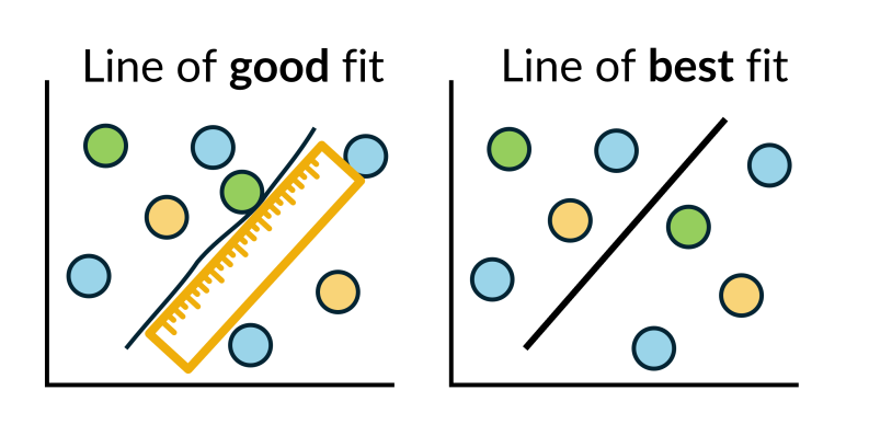
Review that the relationship between two variables can be described in terms of direction, strength, and linearity. Explain that one way to summarise the overall pattern in a scatterplot is to draw a line of good fit.
Explain that, in this lesson, the term “line of good fit” will be used to mean “a straight line drawn to approximate linear relationships”. Note that not all relationships are linear, and that in other contexts, a best-fitting model may be curved.
Provide students with the Lines of good fit Student sheet, which includes four scatterplots showing:
- Graph 1: a moderate to strong positive linear relationship
- Graph 2: a weak negative linear relationship
- Graph 3: a moderate to strong negative linear relationship
- Graph 4: a strong but clearly non-linear relationship
Individually, students draw a single straight line of good fit on each scatterplot, by eye, to represent the overall trend in the data.
Have students compare the lines they drew in small groups and discuss similarities and differences.
Discuss:
- For which scatterplots does a straight line hide important features of the relationship?
- A straight line can hide important features when the relationship is non-linear or very weak, as it may mask curvature or suggest a stronger linear association than actually exists.
- Which scatterplots allow you to make the most reliable predictions using a straight line? Why?
- Scatterplots with a strong and approximately linear relationship allow for the most reliable predictions, as the data points lie close to the line. When the relationship is weak or non-linear, predictions from a straight line are less reliable.
- In which scatterplots did different students draw very similar lines of good fit? What does this suggest about how consistent or dependable the straight-line model is for that data?
- When most students draw very similar lines of good fit, this suggests that the straight-line model is consistent and dependable for that data, as small differences in judgement do not change the overall interpretation. This idea is referred to as “reliability”: a model is more reliable when different people applying the same method reach similar conclusions.
A line of good fit
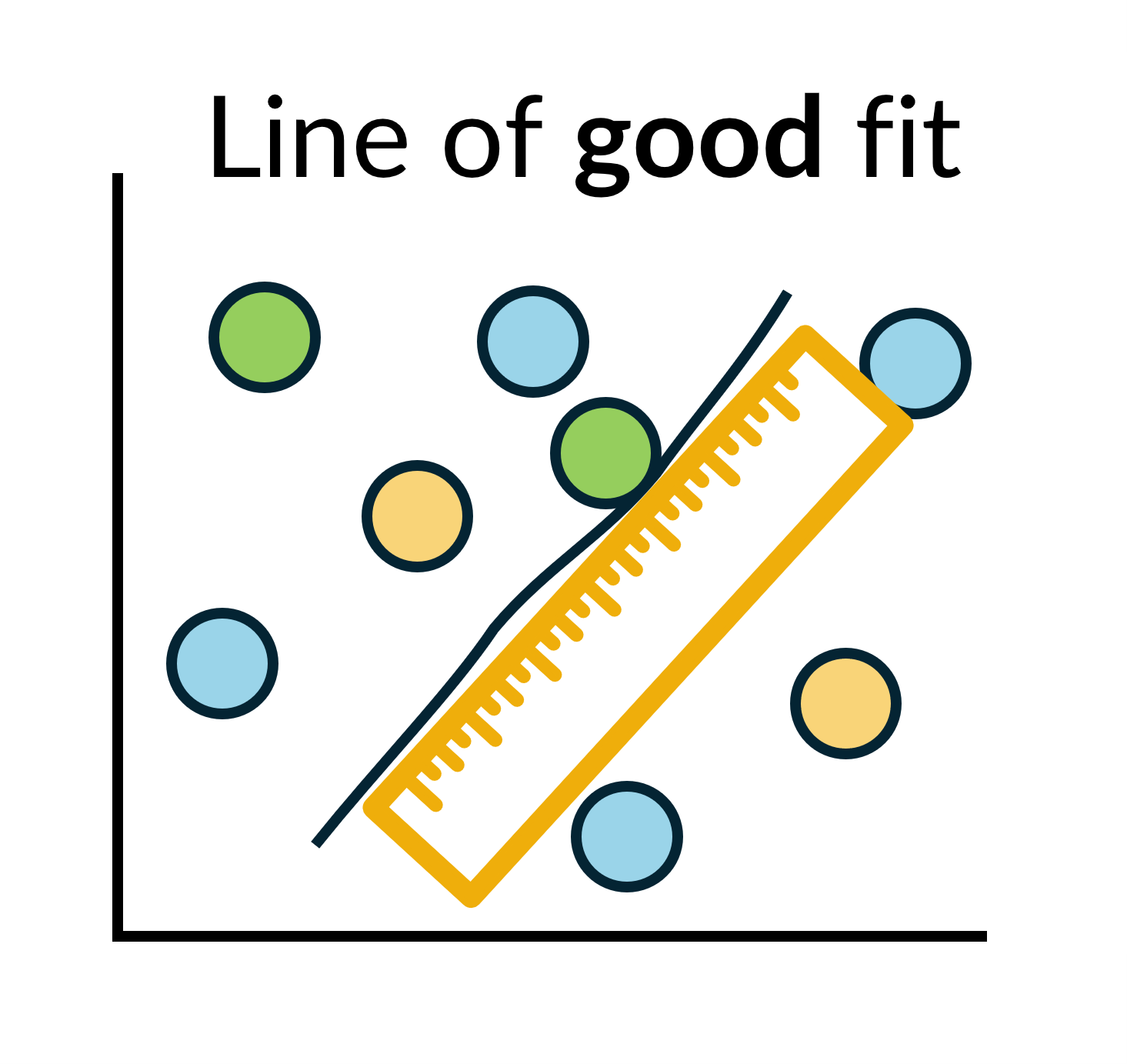
A line of good fit is a straight line drawn by hand to model the overall trend in a scatterplot when the relationship between two variables is approximately linear.
The term “line of good fit” is sometimes used interchangeably with “line of best fit”. In this lesson, a “line of good fit” refers to a straight line drawn by hand to model an overall trend, while a “line of best fit” (also known as a least squares regression line) is calculated using a formal mathematical method to determine an optimal straight-line model.
A line of good fit should reflect the overall pattern in the data rather than individual points. A useful rule of thumb is to position the line so that:
- there are approximately equal numbers of points above and below the line.
- most points lie reasonably close to the line.
There are several common errors to avoid. These include:
- simply drawing a straight line through the first and last data points.
- forcing the line to pass through the origin.
- choosing a line solely because it passes through the greatest number of points while ignoring points far from the line.
- joining points sequentially.
Joining points may be appropriate in a time-series graph, where the order of data matters, but it is not appropriate when using a scatterplot to explore relationships between variables to make predictions.
The video How to draw a line of best fit (and AVOID the most common MISTAKES) demonstrates how to draw a line of good fit by hand and highlights common errors students may make.
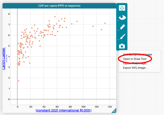
Ask students to open their CODAP file showing the 2023 GDP per capita (PPP) versus Cantril Ladder score scatterplot.
Explain to students that they are going to model the overall trend in the data by drawing their own line of good fit before comparing it to a calculated model.
Ask students to use the drawing tool in CODAP to sketch a straight line that they think represents the overall pattern in the data. Allow students to compare their lines with a partner and discuss any differences.
Explain that these are examples of lines of good fit. They are drawn using judgement to represent the general trend.
CODAP allows users to draw their own line directly onto the scatterplot.
Click on the camera icon to the right of the scatterplot and select “Open in Draw Tool”.
A drawing panel will open. Select the line tool from the toolbar on the left-hand side. The thickness and colour of the line can also be adjusted.
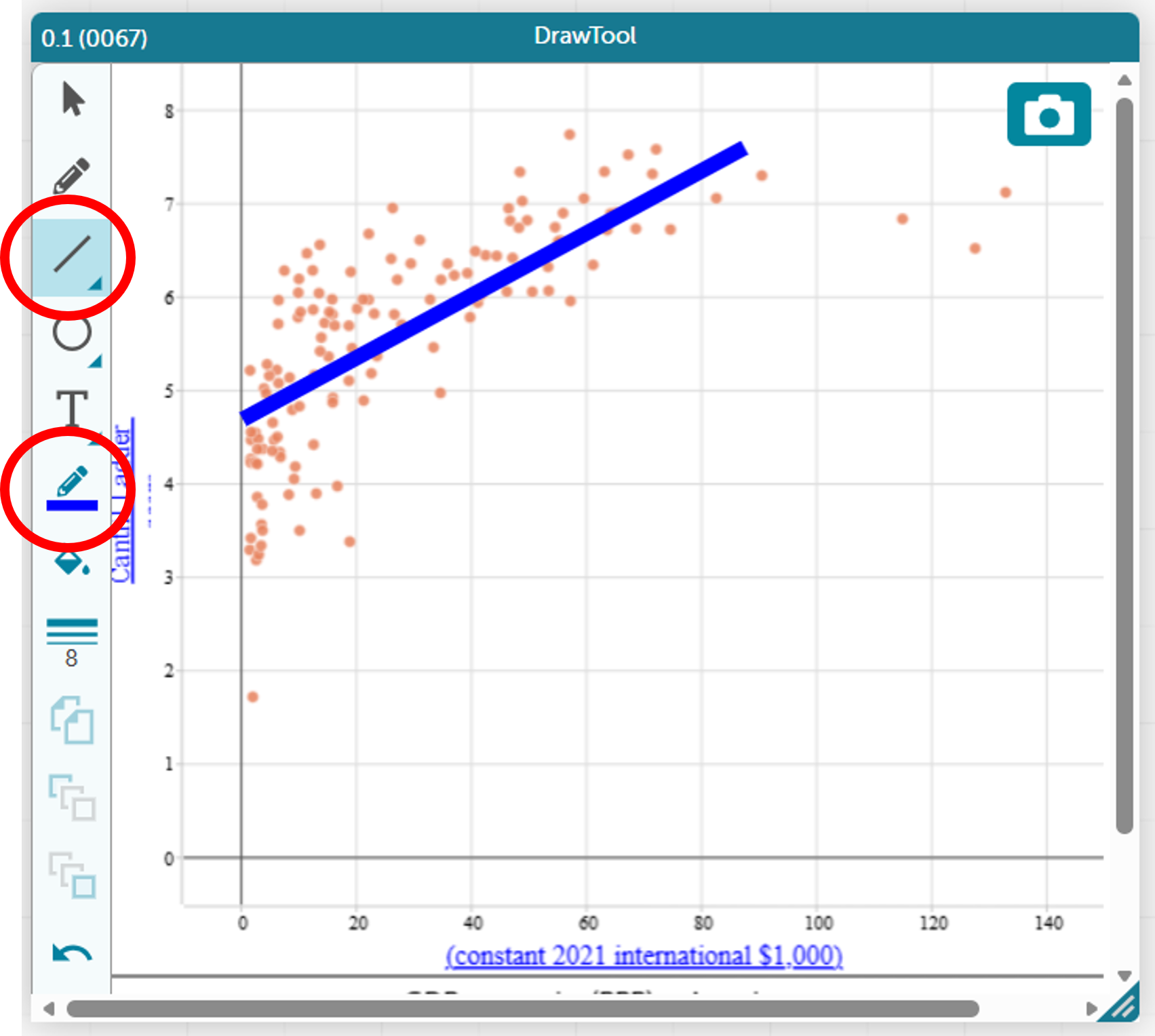
Next, explain that CODAP can calculate a straight-line model using a mathematical method, also known as a least squares regression line. Ask students to add a calculated line to their scatterplot.
Invite students to compare the calculated line with the line they originally drew:
- Where do the lines differ the most, and what might explain those differences?
- If you used each line to make a prediction, would the predictions be the same or different?
CODAP uses the least squares regression to find the equation and display the line of best fit. It gives the equation of this line in worded form, which assists students in interpreting and using this line.
Select the scatterplot, then click on the ruler icon to the right of the scatterplot and tick “Least Squares Line”.
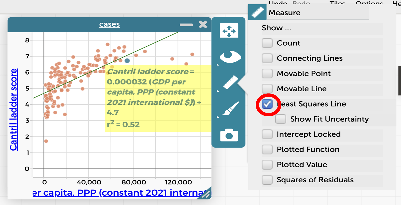
The scatterplot will now look like this:
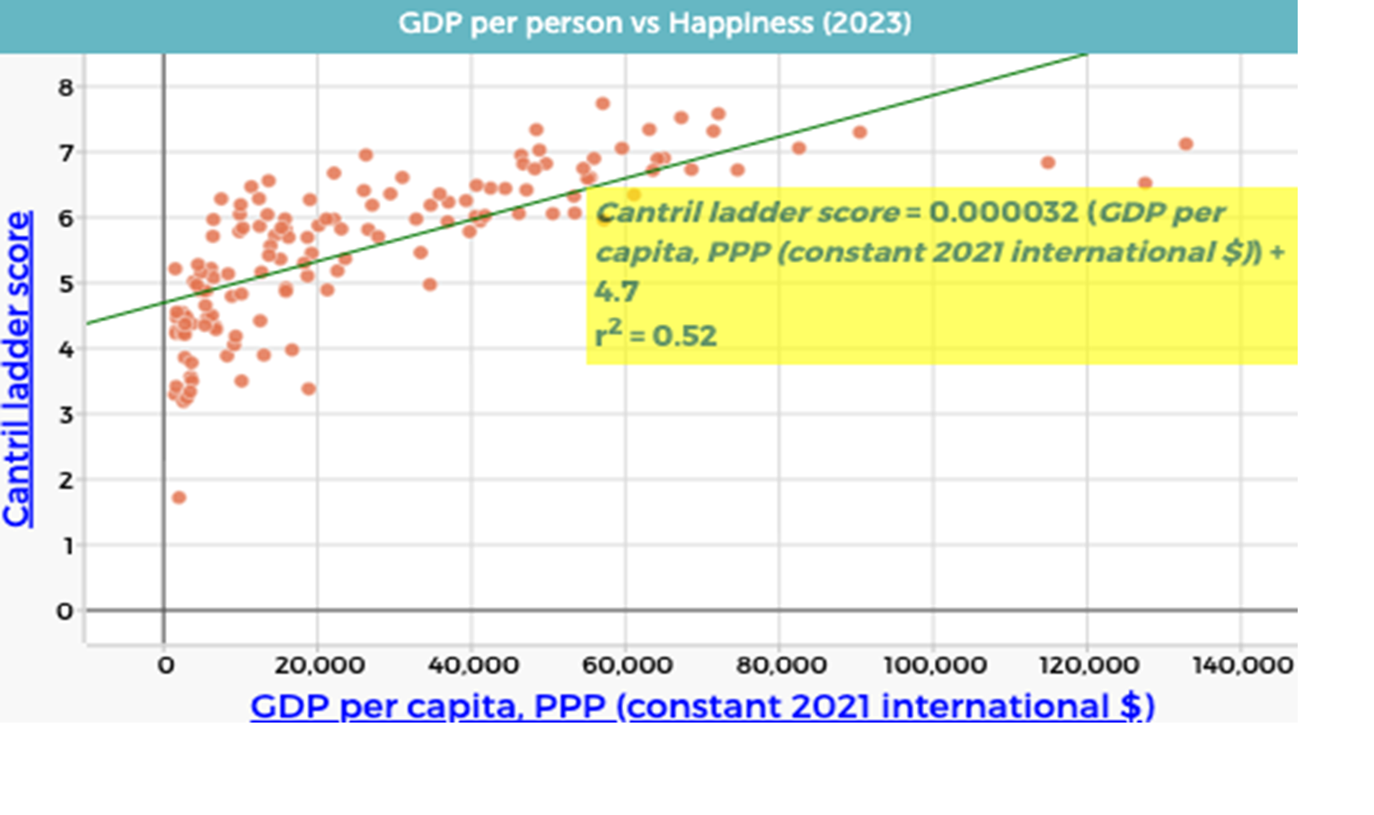
As a class agree that CODAP has generated the equation: $$\text{Cantril Ladder score} = 0.000032 \times \text{GDP per capita (PPP)} + 4.7$$
Remind students that this equation has the same form as $y = mx + c$, where the gradient and intercept have contextual meanings.
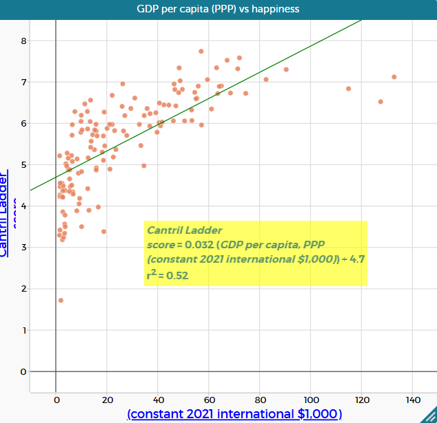
Explain that the small gradient reflects the large scale of GDP values. Replace “GDP per capita (PPP) (constant 2021 international \$)” with “GDP per capita (PPP) (constant 2021 international \$1,000)” by dragging the appropriate column onto the horizontal axis. This results in the equation
$$\text{Cantril Ladder score} = 0.032 \times \text{GDP per capita (PPP)} + 4.7$$
which represents the same relationship on a more interpretable scale.
A line of good versus best fit
In this lesson, students draw a line of good fit by eye before viewing the line of best fit generated in CODAP. This sequence is intentional. Drawing a line by hand encourages students to attend to the overall pattern and trend in the data, reinforcing that a line is a model of the relationship between two variables rather than a precise description of every data point.
When students then compare their hand-drawn line with the line of best fit produced by CODAP, they are prompted to notice both similarities and differences. This comparison highlights that a line of best fit is generated using a formal statistical method, while a line of good fit reflects informed visual judgement. The regression line is more accurate in a numerical sense, while a hand-drawn line can be sufficiently accurate for interpreting the overall relationship. Both aim to represent the same underlying relationship, but they are constructed in different ways and may not coincide exactly.
Making this distinction explicit supports students’ understanding of modelling with data. It emphasises that statistical tools automate processes that can first be reasoned about conceptually, and that interpretation and evaluation of models remain essential, even when technology is used.
Least squares regression: the line of best fit

Linear regression is the process of fitting a linear model to a set of bivariate data in order to describe the relationship between two variables. A straight line can be drawn by eye to model the overall trend in a scatterplot, using informed visual judgement. Digital tools such as CODAP, however, calculate a specific type of linear regression known as “least squares linear regression”.
The least squares regression line is defined by a mathematical rule: it is the straight line that minimises the sum of the squared vertical distances between the data points and the line. These vertical distances are called residuals. When residuals are squared, positive and negative deviations both become positive, so they can be combined meaningfully. Squaring also magnifies larger deviations more than smaller ones, which means points far from the line have a greater influence on the fitted model. The resulting line is referred to as the least squares regression line, or line of best fit. The video Pearson's Correlation Coefficient (3 of 3: Least squares regression line) by Eddie Woo provides a clear visual explanation of this process (particularly 0:18-5:33).
The slope (gradient) of the least squares regression line describes how the dependent variable is expected to change, on average, for a one-unit increase in the independent variable. For example, if the slope is 0.03, this means that for each one-unit increase in the independent variable, the dependent variable always increases by 0.03 units. This interpretation should always be expressed using the units of the variables involved (e.g. “per $1 000 increase in GDP per capita”).
The vertical intercept ($y$-intercept) represents the predicted value of the dependent variable when the independent variable is zero. In some contexts, this value is meaningful. In others, it is simply a feature of the mathematical model and should be interpreted with caution.
When digital tools such as CODAP calculate a least squares regression line, they often also report the coefficient of determination, $r^2$. This value indicates how well the linear models accounts for the variation in the data and is closely connected to the sum of squared residuals. This measure is explored further in Lesson 5.
Show slide 17 of What makes us happy? PowerPoint which shows the relationship between GDP per capita (PPP) and the Cantril Ladder score.
Ask:
- What is the gradient for this line of best fit? What does the gradient mean in this context?
- The gradient is 0.032. This means that for every additional $1 000 in GDP per capita (PPP) (one unit on the horizontal axis), the average happiness score is predicted to increase by about 0.032 points on the Cantril Ladder scale.
- What is the $y$-intercept of the line of best fit? What is the meaning of the $y$-intercept in this context? Is it useful?
- The $y$-intercept is 4.7. It represents the predicted happiness score when GDP per capita (PPP) is zero. This is not meaningful in this context, as no country has a GDP per capita (PPP) of $0.
- Using the line of best fit, what happiness score would you predict for a country with a GDP per capita (PPP) of $100 000?
- The predicted happiness score would be approximately 7.8.
- Using the line of best fit, what GDP per capita (PPP) would you predict for a country with a happiness score of 6?
- The predicted GDP per capita (PPP) would be approximately $40 000.
Provide students with the Predicting happiness Student sheet. This sheet asks students to choose any five countries then use the equation of the least squares regression line to calculate the predicted Cantril Ladder score and compare their predicted results with the actual Cantril Ladder scores according to the data.
Ask:
- How closely did your predicted values match the data shown on the scatterplot? Which result(s) are you more confident in?
- Some predictions using the equation will closely match the actual Cantril Ladder score, some will not. Points on the scatterplot that are far from the line of best fit will have the largest residuals (differences between actual and predicted values).
- Where does Australia fit on this graph and how does it compare to the prediction?
- Australia has a GDP per capita (PPP) of \$59 550 and an actual Cantril Ladder score of 7.06. Using the equation, the predicted happiness score is $0.032 \times 59.55 + 4.7 = 6.61$. Australia’s actual score is therefore 0.45 points higher than predicted, which can be seen on the scatterplot—the point for Australia sits above the line of best fit.
- Explain that this is an example of prediction based on interpolation, that is, estimating values within the range of the observed data.
- What if we used a GDP per capita (PPP) value of $200 000?
- This would give a Cantril Ladder score of approximately 11.1, which does not make sense as the top of the scale is a score of 10. This suggests that the linear model is not appropriate for predicting happiness at very high GDP per capita values.
- Explain that this is an example of prediction based on extrapolation, that is, estimating values outside the range of the observed data.
- What GDP per capita (PPP) would produce a happiness score of 10? Is it possible to have a happiness score of 10?
- When Cantril Ladder score = 10:
$$\begin{align} 10 &= 0.032 \times \text{GDP per capita (PPP)} + 4.7 \\
10 - 4.7 &= 0.032 \times \text{GDP per capita (PPP)} \\
5.3 &= 0.032 \times \text{GDP per capita (PPP)} \\
\text{GDP per capita (PPP)} &= 5.3 \div 0.032 \\
\text{GDP per capita (PPP)} &= 165.625 \end{align}$$ Solving the regression equation gives a predicted GDP per capita (PPP) of $165 625 for a Cantril Ladder score of 10. - Note that the three countries with the highest GDP per capita (PPP) (Ireland, Singapore and Luxembourg) all have Cantril Ladder scores that fall noticeably below the line. While, in theory, all citizens in a country could report the highest possible Cantril Ladder score, in reality human experience and life circumstances mean this is unlikely. This also highlights that happiness is not solely determined by economic wealth.
- When Cantril Ladder score = 10:
- What GDP level relates to a Cantril Ladder score of 4.5? What does this result mean?
- When Cantril Ladder score = 4.5:
$$\begin{align}4.5 &= 0.032 \times \text{GDP per capita (PPP)} + 4.7\\
4.5 - 4.7 &= 0.032 \times \text{GDP per capita (PPP)}\\
-0.2 &= 0.032 \times \text{GDP per capita (PPP)}\\
\text{GDP per capita (PPP)} &= -0.2 \div 0.032\\
\text{GDP per capita (PPP)} &= -6.25 \end{align}$$ As a measure of a country’s total income, GDP per capita cannot be negative. - This result suggests that the model begins to fail at lower values of happiness and will never predict a Cantril Ladder score below 4.7 (the $y$-intercept). This is an issue as a number of countries on the graph have a happiness score below this value.
- When Cantril Ladder score = 4.5:
Remind students that the sequence began with the question: Is there a relationship between the wealth of a country and its happiness rating? Based on the data and models explored, invite students to think how they might answer this question now.
Discuss:
- How did using a line of best fit help you move from a general impression of the data to a more evidence-based conclusion?
- What does the line of best fit capture well about the relationship between the two variables, and what does it leave out?
- Why do some countries lie far above or below the line of best fit? What does this tell us about using wealth alone to explain happiness?
Interpolation and extrapolation when making predictions
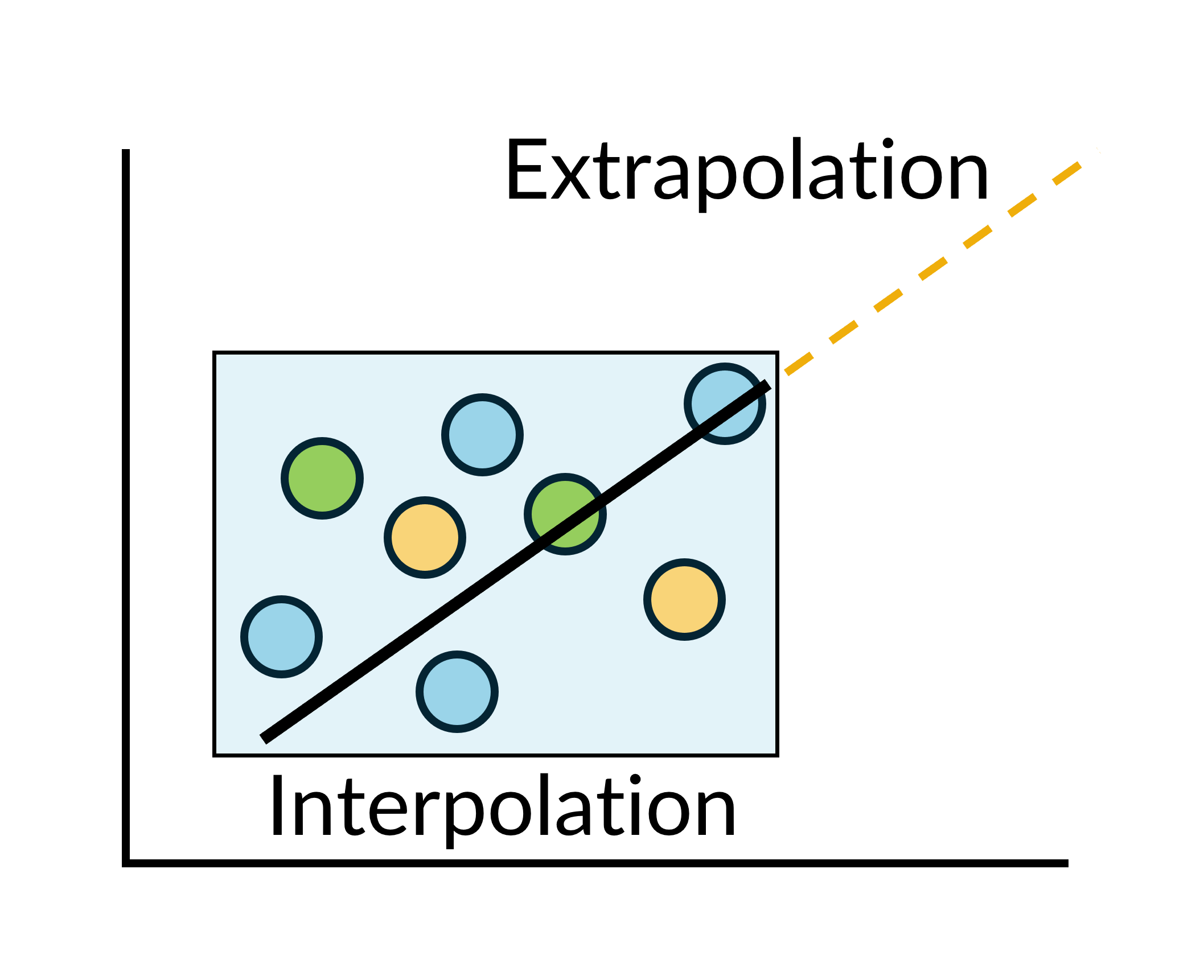
The line of best fit can be used to make predictions by substituting chosen values for the independent variable into the equation.
When we substitute a value that lies within the range of values of that variable in our known data, we call this an interpolation (inter = between). The strength of the relationship between the variables influences how confident we can be about the outcomes of this prediction.
This table provides a general guide only. Confidence also depends on how closely the data cluster around the line and where the prediction lies within a data range.
| Strength | Confidence of interpolation |
| Strong | High |
| Moderate | Medium |
| Weak | Low |
When we substitute a value that lies outside the range of values of that variable in our known data, we call this an extrapolation (extra = outside). Regardless of the strength of the correlation within our data set, extrapolation is unreliable because the model is based only on observed data and may not apply beyond that range.