Mathematical modelling: What makes us happy?
View Sequence overviewScatterplots help us see relationships between two numerical variables and notice patterns, trends, and variation.
Direction, strength, and overall form help us describe relationships between two variables.
Data allow us to investigate and evaluate claims about relationships in real-world contexts.
Whole class
What makes us happy? PowerPoint
Each student
Access to a computer and the online data analysis tool CODAP (https://codap.concord.org/). Alternatively, students can work together in pairs with a shared computer.
What makes us happy? Spreadsheet
Task
Show slide 10 of What makes us happy? PowerPoint which shows the World Happiness map. Invite students to suggest factors they believe may contribute to higher happiness ratings in countries around the world. Ask students to justify their suggestions using evidence from their exploration of the map in the previous lesson.
Explain to students that throughout this sequence they will look more closely at wealth and investigate whether being wealthier is associated with a country being happier.
Pose the question: Is there a relationship between the wealth of a country and its happiness rating?
Explain to students that Gross Domestic Product (GDP) is commonly used to estimate a country’s economic wealth. Tell students that they will analyse GDP per capita (PPP), which takes into account both population size and differences in the cost of living, allowing for fairer comparisons between countries.
Read more about GDP and PPP in the What is GDP and PPP? professional learning embedded below.
Explain to students that they will create a scatterplot to explore whether there is a relationship between the wealth of a country and its happiness rating. Explain that in a scatterplot:
- the independent variable is the variable we choose to investigate. In this instance, the independent variable is GDP per capita, and it is placed on the horizontal ($x$) axis.
- the dependent variable is the variable being measured or observed. In this instance, the dependent variable is the Cantril Ladder score, and it is placed on the vertical ($y$) axis.
Provide students with access to computers and the What makes us happy? Spreadsheet. Ask students to open the first sheet, 2023 GDP per capita, using the tabs at the bottom of the window.
Explain to the students that this sheet contains the Cantril Ladder score and the GDP per capita (PPP) collected from different countries in 2023 (retrieved from the World Happiness Report). The units reported are “in constant 2021 international dollars”, meaning they have been adjusted for inflation, so comparisons are not affected by changes in prices over time.
Ask students to copy the dataset into CODAP and create a scatterplot with GDP per capita on the horizontal axis and the Cantril Ladder score on the vertical axis. Explain that each point in the scatterplot represents a data point (a country), where the horizontal axis shows GDP per capita (the independent variable) and the vertical axis shows the Cantril Ladder score (the dependent variable).
CODAP is a freely available browser-based powerful statistics tool designed to support learners in developing skills and understanding in data analysis. While spreadsheet software like Microsoft Excel and Google Sheets are familiar to many teachers and students, CODAP promotes better data hygiene and requires less technical work to perform statistical calculations. Unlike professional statistics tools (e.g. R or SPSS), CODAP is simple to learn, allowing students to get into analysing statistical results quickly.
CODAP can be found at https://codap.concord.org/.

The developers of CODAP have made a number of tutorials, guides, and videos available to help get users up to speed. You can access these on the Get Started page.
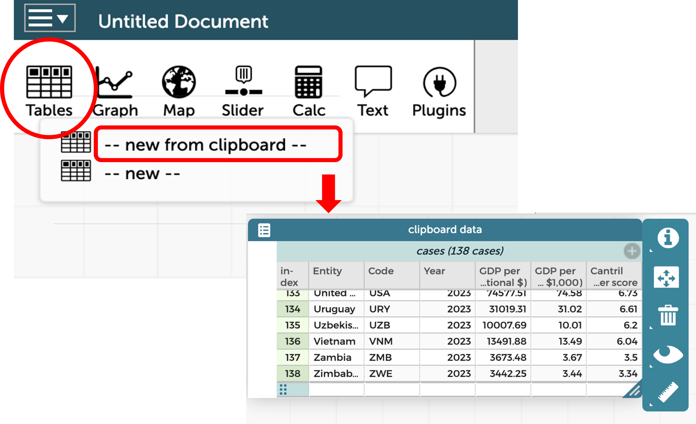
Copying a dataset into CODAP
Open the What makes us happy? Spreadsheet and copy all the data in the first sheet, 2023 GDP per capita.
On the CODAP website, click “Launch CODAP” then “Create new document”.
Click on the Tables icon in the top left and select “--new from clipboard--”.
Your clipboard data should appear in a table within CODAP. You may need to “Allow” the website to access your clipboard.
Creating a scatterplot in CODAP
Follow these steps to create a scatterplot with the variable “2023 GDP per capita (PPP)” on the horizontal axis and “Cantril Ladder score” on the vertical axis.
Click the graph icon in the top left and a blank scatterplot will appear.
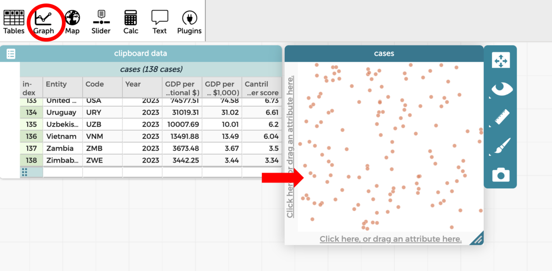
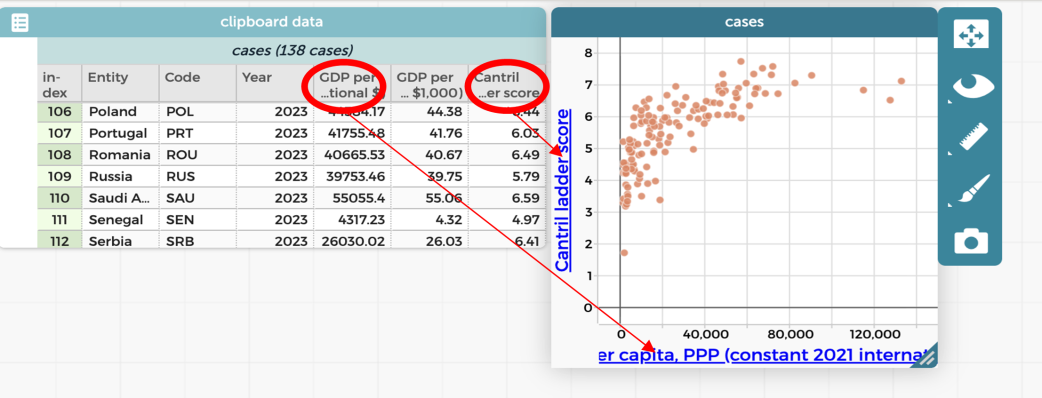
Click in the header cell of the fifth column “2023 GDP per capita (PPP)” and drag it onto the horizontal axis in the blank scatterplot.
Click in the header cell of the seventh column “Cantril Ladder score” and drag it onto the vertical axis in the blank scatterplot.
Note that CODAP may truncate long variable names on the axes. If this causes confusion, students can check the full name in the data table or temporarily shorten the variable label.
What is GDP and PPP?

In this investigation, students analyse the variable “GDP per capita (PPP)”. GDP per capita (PPP) is calculated by dividing a country’s Gross Domestic Product (GDP) by its population. It provides an estimate of the average economic output or income per person. To make enable meaningful comparisons between countries, the values are expressed in Purchasing Power Parity (PPP) terms. The PPP adjustment accounts for differences in the price levels between countries, based on the idea that a standard bundle of goods and services should have comparable purchasing power once prices are adjusted. This allows economic output and living standards to be compared more fairly across countries.
The data used in this lesson are also reported in constant (inflation-adjusted) PPP dollars. This means the figures have been adjusted to remove the effects of inflation over time. As a result, any comparisons across years reflect real changes in economic output rather than changes in price levels.
Scatterplots
A scatterplot is a graph used to explore the relationship between two numerical variables (bivariate data). Each point on the graph represents a single observation and shows the values of both variables simultaneously, with one variable plotted on the horizontal axis and the other on the vertical axis. Scatterplots can be used to identify patterns or trends in data, describe the direction and strength of association between variables, and identify outliers.
When constructing a scatterplot, it is helpful to consider whether one variable might reasonably depend on the other. The independent variable is the variable that is chosen or controlled, such as time. The dependent variable is the variable that is measured or observed and is expected to change in response to the independent variable. For example, as children get older, they tend to grow taller. In this context, age is the independent variable because it does not change as a result of height, while height is the dependent variable because it changes as age increases. When drawing a scatterplot to represent this relationship, the independent variable (age) is placed on the horizontal axis, and the dependent variable (height) is placed on the vertical axis.
Display slides 11 to 14 of What makes us happy? PowerPoint. Explain that the relationship between two variables in a scatterplot is described in terms of direction, strength, and linearity. Slides 12-14 show how direction and linearity can be identified from the overall pattern in the data. In this lesson, the strength of the relationship can be judged visually. Later, this visual judgement can be compared with a computer-generated measure of correlation.
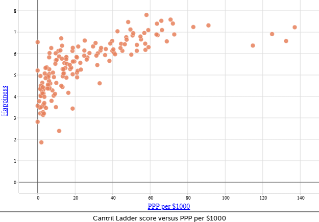
Ask students to return to the scatterplot they have created, showing happiness on the vertical axis and wealth on the horizontal axis, and consider the question: Is there a relationship between the wealth of a country and its Cantril Ladder score? Prompt them to describe the relationship they see in terms of direction, strength, and linearity.
Discuss:
- How would you describe the direction of this scatterplot? How do you know?
- There is a positive correlation between GDP per capita (PPP) and Cantril Ladder score, with Cantril Ladder scores generally increasing as GDP per capita (PPP) increases. The data form an upward-sloping pattern, indicating a positive relationship, where countries with lower Cantril Ladder scores tend to have lower GDP per capita (PPP) and those with higher Cantril Ladder scores tend to have higher GDP per capita (PPP).
- What is the strength of this relationship?
- There is a moderate correlation. You can see that there is a pattern, but the points do not form a very close approximation of a straight line.
- Would you describe this as a linear relationship?
- The points form a line shape at the start sloping upwards from left to right. The line flattens out after around $60 000 in GDP.
Discuss how the graph illustrates correlation, not causation. Wealth and happiness are correlated because changes in one variable are associated with changes in the other. However, this does not mean that wealth causes happiness. This distinction will be explored in more depth in Lesson 5.
Ask students to save their CODAP file.
CODAP files are a little unusual. Because CODAP is browser-based, CODAP files can only be opened from within the browser. Many students get confused when they try to open a downloaded CODAP file by double-clicking on it—this won’t work!
Students with Google accounts can connect CODAP to their Google Drive by clicking the menu at the top left then “Save...” > “Google Drive”.
Alternatively, this video demonstrates how to save and open a CODAP file.
Describing correlation
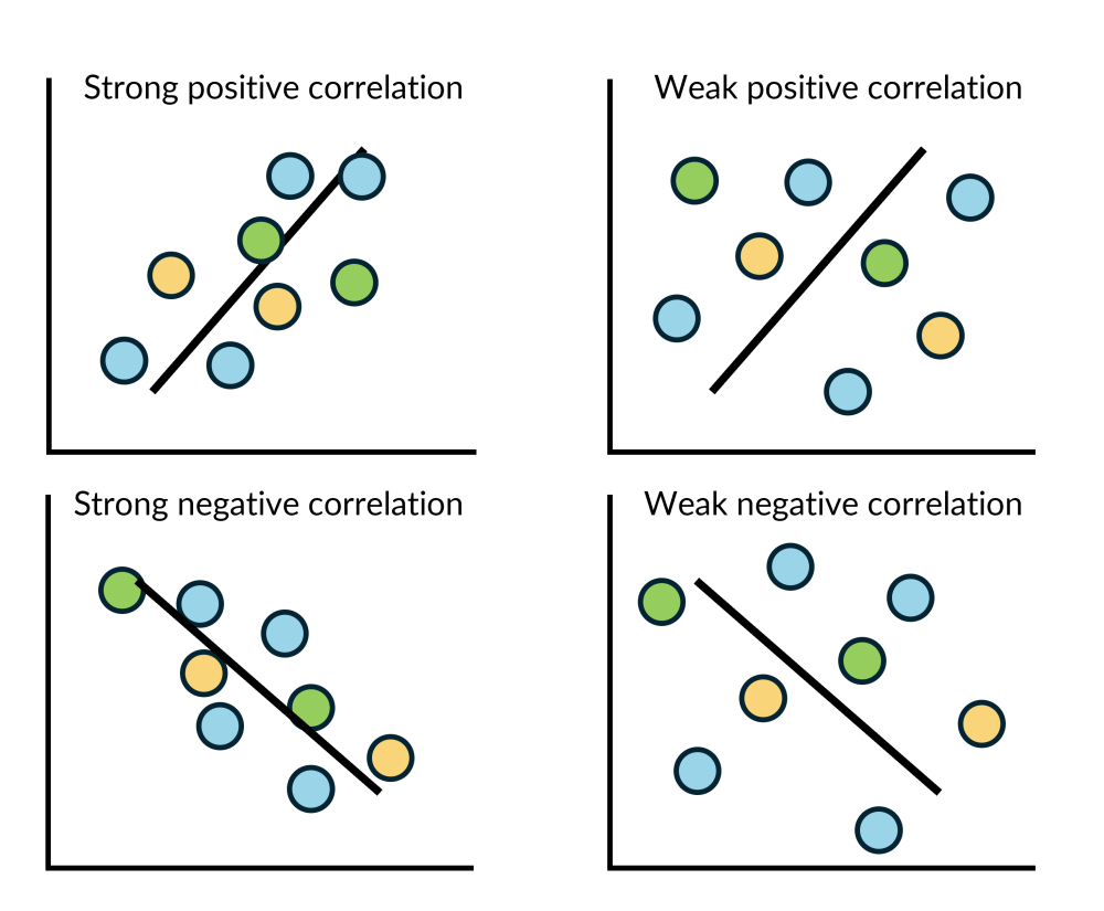
A quick visual inspection of a scatterplot can reveal three important features of the relationship, or correlation, between two variables: direction, strength, and linearity.
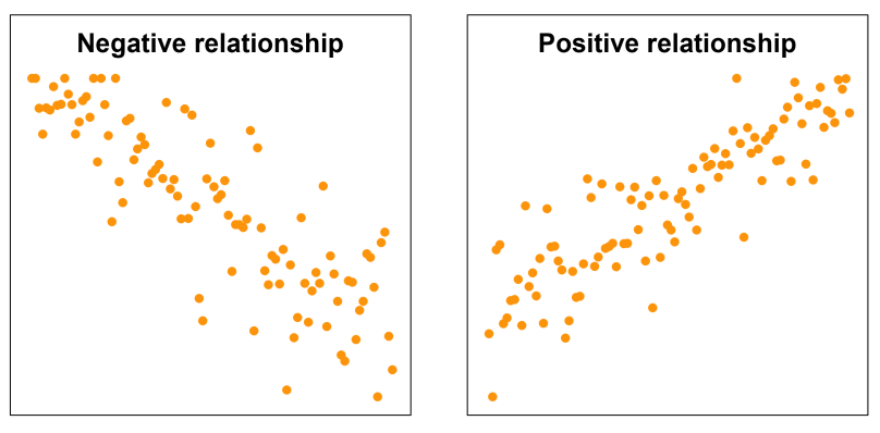
Direction
The direction of a relationship describes whether the variables tend to increase or decrease together. A positive correlation occurs when both variables increase or decrease together. For example, as a child’s age increases, their height also tends to increase. In a scatterplot, a positive linear correlation is indicated when the points roughly follow a line with a positive gradient, sloping upwards from left to right. A negative correlation occurs when one variable increases as the other decreases. For example, as time spent using a phone increases, the remaining battery life decreases. In a scatterplot, a negative linear correlation is shown by points that roughly follow a line with a negative gradient, sloping downwards from left to right.
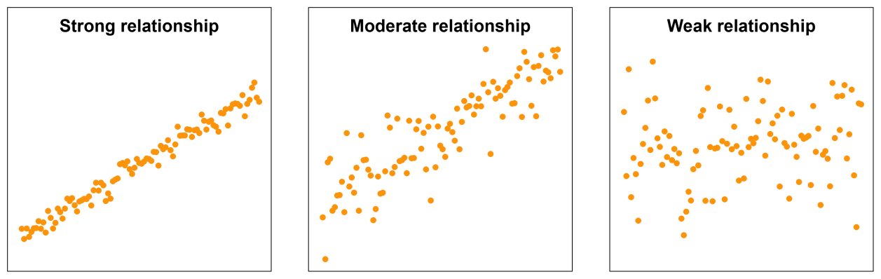
Strength
The strength of a correlation describes how closely the points follow a general pattern. Strength is often described as strong, moderate or weak, although these categories are not strictly defined. A strong correlation is indicated when points lie close to a straight line. A moderate correlation shows a clear overall direction, but with more spread around the line. A weak correlation appears as a scattered cloud of points, with only a vague sense of direction.
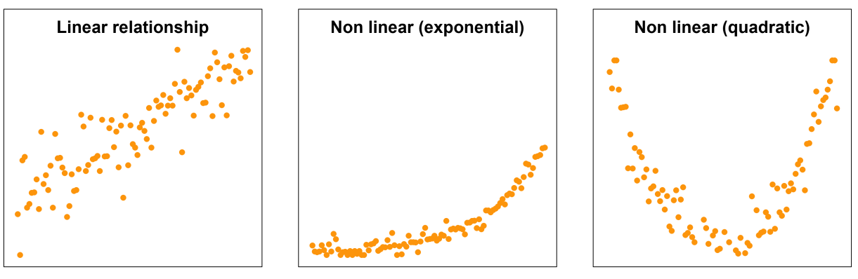
Linearity
Linearity refers to the shape of the relationship. At this stage, students consider whether the relationship appears linear, forming an approximate straight line, or non-linear, forming a curved pattern. Linearity is usually easier to identify when the correlation is stronger.
A quick visual inspection of a scatterplot can reveal three important features of the relationship, or correlation, between two variables: direction, strength, and linearity.
Direction
The direction of a relationship describes whether the variables tend to increase or decrease together. A positive correlation occurs when both variables increase or decrease together. For example, as a child’s age increases, their height also tends to increase. In a scatterplot, a positive linear correlation is indicated when the points roughly follow a line with a positive gradient, sloping upwards from left to right. A negative correlation occurs when one variable increases as the other decreases. For example, as time spent using a phone increases, the remaining battery life decreases. In a scatterplot, a negative linear correlation is shown by points that roughly follow a line with a negative gradient, sloping downwards from left to right.
Strength
The strength of a correlation describes how closely the points follow a general pattern. Strength is often described as strong, moderate or weak, although these categories are not strictly defined. A strong correlation is indicated when points lie close to a straight line. A moderate correlation shows a clear overall direction, but with more spread around the line. A weak correlation appears as a scattered cloud of points, with only a vague sense of direction.
Linearity
Linearity refers to the shape of the relationship. At this stage, students consider whether the relationship appears linear, forming an approximate straight line, or non-linear, forming a curved pattern. Linearity is usually easier to identify when the correlation is stronger.
Ask students to access the second sheet in What makes us happy? Spreadsheet, titled 2012 GDP per capita. Students copy this dataset into CODAP and create a scatterplot with the variable GDP per capita (PPP) on the horizontal axis and the Cantril Ladder score on the vertical axis. Students then compare the 2012 scatterplot with the scatterplot they created from the 2023 dataset.
The two scatterplots are shown below side by side, with Australia highlighted (to highlight a data point in a scatterplot, select the country’s name in the table).
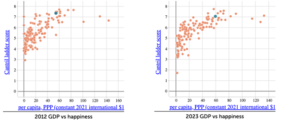
Ask students to compare the strength, direction, and linearity of the two scatterplots. This again helps to answer the question: Is there a relationship between the wealth of a country and its Cantril Ladder score?
Discuss:
- In each graph, does happiness tend to increase, decrease, or stay the same as GDP per capita (PPP) increases?
- The points are forming a pattern that slopes upwards which indicates a positive correlation. As GDP per capita (PPP) increases, Cantril Ladder scores tends to increase.
- Are there parts of the graph where the relationship appears stronger or weaker? Is this similar in both years?
- How has Australia’s position has changed between 2012 and 2023?
Comparing the 2012 and 2023 datasets reinforces that statistical relationships can persist over time while still varying in strength or distribution, highlighting the importance of careful analysis when interpreting real-world data.