Mathematical modelling: What makes us happy?
View Sequence overviewThe coefficient of determination, $r^2$, helps us understand how much of the variation in one variable is explained by a linear model.
Comparing values such as $r^2$ helps us judge the relative strength of linear models.
A strong correlation does not necessarily mean that one variable causes change in another.
Whole class
What makes us happy? PowerPoint
Each group
Interpreting $r^2$ Student sheet
Causation vs correlation Student sheet
Each student
Access to a computer and the online data analysis tool CODAP (https://codap.concord.org/). Alternatively, students can work together in pairs with a shared computer.
What makes us happy? Spreadsheet
Factors that influence happiness Student Sheet
Task
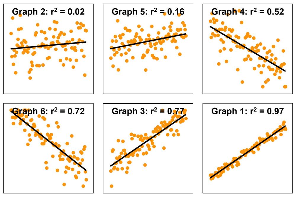
Show slide 20 of What makes us happy? PowerPoint which shows three scatterplots, each with a line of best fit and associated $r^2$ value.
Give students time to observe the graphs.
Ask:
- What do you notice about the scatterplots with higher $r^2$ values?
- How do the points compare to the line of best fit in graphs with lower versus higher $r^2$ values?
- What do you think the $r^2$ value might be describing?
Explain that $r^2$, called the “coefficient of determination”, is a number that describes how well the line of best fit explains the pattern in the data.
Emphasise that:
- a higher $r^2$ value means the line does a better job of matching the pattern in the data.
- a lower $r^2$ value means that the line does not match the data as closely.
- when points are more spread out from the line, the $r^2$ value is lower.
- $r^2$ does not describe how steep the line is or whether the relationship is positive or negative.
Students are not expected to calculate $r^2$. The focus at this stage is on interpreting what it tells us about the fit of a linear model.
Interpreting $r^2$
The coefficient of determination, $r^2$, provides a measure of how well a linear model explains the variation in a set of bivariate data. For example, if $r^2=0.52$, then 52% of the variation in the dependent variable can be explained by its linear relationship with the independent variable.
When points lie close to the line, residuals (the vertical distances between points and the line) are generally small, and the corresponding $r^2$ value is higher. When points are more widely scattered, the residuals are larger overall, and the $r^2$ value is lower.
At this stage, students should interpret $r^2$ qualitatively: a higher $r^2$ indicates a tighter clustering of points around the line and a stronger linear relationship, while a lower $r^2$ indicates greater spread and a weaker linear relationship.
There is no universally agreed definition of the $r^2$ values that correspond with strong, moderate or weak correlation. Some indicative boundaries used by many, but not all, statisticians for using $r^2$ to interpret the strength of a relationship are presented in the table below. These boundaries are used in this lesson.
| Range of $r^2$ values | Strength |
| $$0.9 \lt r^2 \le 1$$ | Strong |
| $$0.5 \lt r^2 \le 0.9$$ | Moderate |
| $$0 \le r^2 \le 0.5$$ | Weak |
Provide students with Interpreting $r^2$ Student Sheet, which includes six scatterplots, each showing a line of best fit and a different amount of spread around the line. Working in groups, students cut out the individual scatterplots and arrange them in an order from highest to lowest expected $r^2$ value.
Ask:
- Which scatterplot do you think has the highest $r^2$ value, meaning the straight line fits the data most closely?
- What visual features are you using to make your decisions?
- Are there any graphs that are difficult to rank? Why?
Encourage students to justify their rankings using informal language such as tighter, more clustered, more spread out, or more scattered, rather than numerical or formula-based explanations.
Once students have agreed on a ranking, show slide 21 of What makes us happy? PowerPoint, and reveal the actual $r^2$ values. Discuss how closely the group rankings align with the values shown. Emphasise that $r^2$ is about how well the line of best fit explains the pattern in the data, not about the steepness or direction of the line.
Draw students’ attention to any pair of scatterplots that appear to have a similar amount of visual spread but noticeably different $r^2$ values (e.g. Graphs 4 and 5).
Ask:
- At first glance, these two graphs look similarly “messy”. Why might their $r^2$ values still be very different?
- In both graphs, the points wobble up and down by a similar amount around the line. However, in Graph 4, the line itself moves a lot from left to right, while in Graph 5, it only moves a small amount. This means the line in Graph 4 explains much more of the variation in $y$ than the line in Graph 5, despite visually having a similar level of “messiness”.
- Which graph would help you make a more confident prediction of $y$ if you only knew $x$? Why?
- Graph 4 would support more confident predictions because its line of best fit has a steeper gradient. As $x$ increases, $y$ changes by a larger amount, so knowing $x$ meaningfully narrows the likely values of $y$. In Graph 5, the gradient is shallow, so $y$ changes only a small amount as $x$ increases. As a result, many different $y$-values occur across the same $x$-values, making predictions less certain.
- What does this comparison tell us about what $r^2$ measures?
- $r^2$ does not measure how noisy or messy the data look on their own. It measures how much of that variation is explained by the line of best fit. A graph can look fairly neat but still have a low $r^2$ if the line explains very little of the overall variation.
Misconceptions when interpreting $r^2$
When interpreting $r^2$, it is important to recognise that it does not measure how steep a line is, nor how messy the data appear on their own. Instead, $r^2$ reflects how much of the variation in the dependent variable is explained by the linear relationship with the independent variable. A higher $r^2$ occurs when the overall change in $y$ across the range of $x$ is large compared to the up-and-down scatter of the data points around the line.
Students often bring intuitive but incomplete interpretations of scatterplots. Several common misconceptions are worth addressing explicitly:
- Assuming a steeper line means a higher $r^2$ value—While the gradient affects how much $y$ changes as $x$ changes, a steep line can still have a low $r^2$ value if there is substantial scatter relative to that change. Conversely, a shallow line can have a high $r^2$ value if the data closely follow the trend.
- Assuming that the amount of scatter alone determines the value of $r^2$—Two graphs can have similar visual “messiness” but very different $r^2$ values. This occurs when the trend explains a large proportion of the variation in one graph, but very little in another.
- Assuming positive relationships are stronger than negative ones—Because the value of $r^2$ is always non-negative, both positive and negative linear relationships can have the same $r^2$ value if the strength of the relationship is similar.
- Thinking $r^2$ represents the percentage of points lying on the line—$r^2$ does not count points. It summarises how well the line explains the overall pattern of variation in the data.
- Concluding that a low $r^2$ value means the model is wrong or useless—A low $r^2$ value indicates that the linear model explains only a small proportion of the variation. This is still meaningful, as it suggests that other factors are influencing the outcome.
Ask students to individually sketch a scatterplot that they think could reasonably have an $r^2$ value of 0.75, and then a second sketch that could reasonably have an $r^2$ value of 0.25. Students should include a line of good fit on each sketch. Emphasise that there is no single correct sketch.
Invite students to share their sketches by:
- holding them up.
- posting an image on a shared electronic whiteboard.
Discuss:
- What similarities do you notice across sketches for $r^2 = 0.72$?
- Do any sketches look quite different from one another but still have similar $r^2$ values? Why might that be?
- What features seem essential for a sketch to be consistent with a higher or lower $r^2$?
Guide the discussion towards the idea that:
- $r^2$ describes the overall clustering around the line, not the exact shape or arrangement of points.
- many different scatterplots can be consistent with the same $r^2$ value.
Ask students to revisit their original sketches for $r^2= 0.75$ and $r^2 = 0.25$ and make any changes based on this discussion.
Challenge students to sketch two new scatterplots for each $r^2$ value that are visibly different from your original sketches but could still reasonably have the same $r^2$ value. Each sketch should include a line of good fit.
Pose the question: What other factors make us happy?
Remind students that at the start of the sequence they brainstormed a wide range of factors they believed might influence happiness. Explain that while many of these ideas are important, the following investigation will focus on a small number of factors for which reliable global data are available.
Show slide 22 of What makes us happy? PowerPoint which displays a list of additional factors:
- health (life expectancy)
- education (years of schooling)
- access to clean water
- hunger
- urbanisation
Students can access data for 201 countries on the available factors, as well as GDP per capita (PPP), from the sheet titled Other factors in the How happy are we? Spreadsheet.
Health is represented using life expectancy. The data use period life expectancy, which estimates the average length of life for people born in a given year, based on observed and predicted mortality rates. Data is from the World Bank.
Education is represented by the average number of years of formal schooling completed by adults aged 25 years and over. Data is from the World Bank.
Access to clean water is represented by the percentage of the population without access to an improved water source, such as piped water, boreholes, protected wells or springs, or delivered water. Data is from the World Bank.
Hunger is represented by the percentage of the population that is undernourished, meaning their daily food intake does not provide enough energy to maintain a normal, active, and healthy life. Data is from the Food and Agriculture Organization of the United Nations (FAO).
Urbanisation is represented by the percentage of the population living in urban areas. Note that definitions of urban vary between countries, which may affect comparisons. Data is from United Nations Department of Economic and Social Affairs (UN DESA).
Explain that students will use the statistical tools they have developed to investigate which of these measurable factors appears to be the strongest predictor of happiness and how confident they can be in that judgement.
Organise students into small groups. Ask each group to:
- Select one factor from the list that they believe will best predict happiness across countries.
- Justify their choice using reasoning from earlier brainstorming in Lesson 1, general knowledge, or prior discussion (no data yet).
- Predict the strength of the relationship (weak, moderate or strong) and the direction (positive or negative).
Each group should then:
- Create a scatterplot using CODAP which shows the relationship between the Cantril Ladder score and their chosen variable.
- Add a line of best fit.
- Record the equation of the line and $r^2$ value.
- Make one interpolation prediction and explains its meaning in context.
Students can record their results on the Factors that influence happiness Student Sheet.
Construct a summary table on the board, for example:
| Factor | Predicted strength | Actual $r^2$ value | What did we learn? |
Invite all groups to contribute their findings to the table.
Discuss:
- Which factor produced the highest $r^2$ value?
- How close were your predictions to the data?
- Were any of the relationships weaker or stronger than expected?
- Did any factor provide a particular convincing model for predicting happiness?
Remind students that a high $r^2$ value indicates tighter clustering around the line of best fit but may explain only part of the variation in happiness, supporting the idea that happiness is influenced by multiple interacting factors rather than a single measurable cause.
In each case, analysis of the relationship between happiness and health, education, access to clean water, hunger, and urbanisation shows only a weak to weak–moderate correlation. This suggests that factors such as wealth, health, education, sufficient food, access to clean water, and urban living each contribute to happiness to some extent, but none alone strongly predicts happiness levels across countries.
The absence of a strong correlation with any single factor indicates that happiness is influenced by multiple interacting factors. It also suggests that other influences, such as personal freedom, social support, safety, and employment, may play a more significant role in shaping happiness than any one measurable variable on its own.
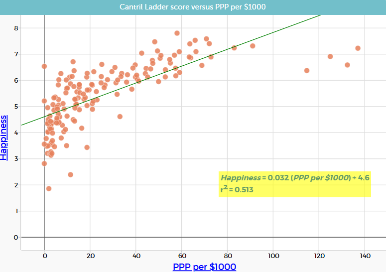
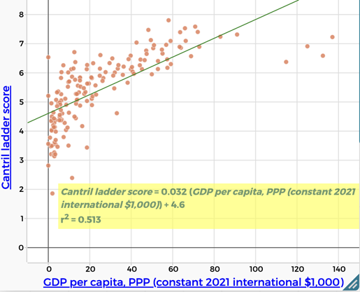 | Wealth/GDP per capita, PPP There is a moderate positive correlation between Cantril Ladder score and wealth (GDP per capita, PPP). ($r^2 = 0.513$) People who are more wealthy are more likely to report being happy. |
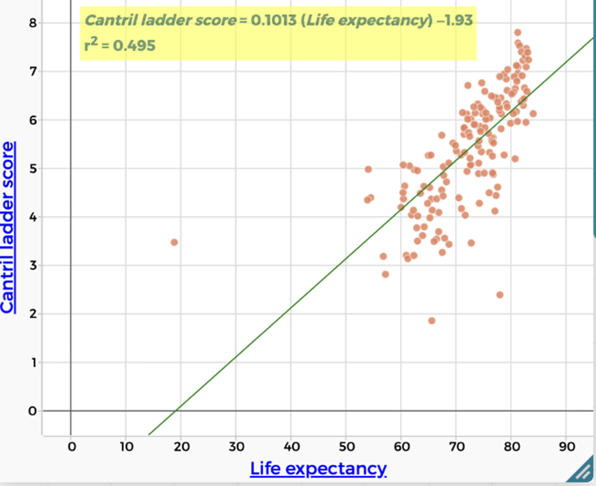 | Health/Life expectancy There is a weak positive correlation between Cantril Ladder score and life expectancy. ($r^2 = 0.495$) People who are expected to live longer are more likely to report being happy. |
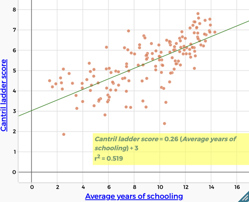 | Education There is a moderate positive correlation between Cantril Ladder score and education levels (years of schooling). ($r^2 = 0.519$) More highly educated people are more likely to report being happy. |
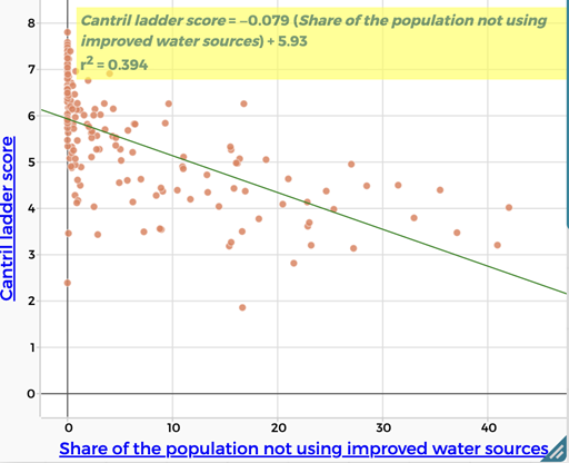 | Lack of access to clean water There is a weak negative correlation between Cantril Ladder score and a lack of access to clean water. People lacking access to clean water are less likely to report being happy. |
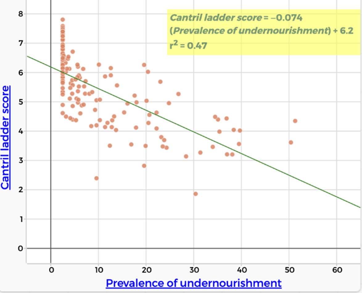 | Hunger There is a weak negative correlation between Cantril Ladder score and hunger. ($r^2 = 0.47$) People who experience hunger are less likely to report being happy. |
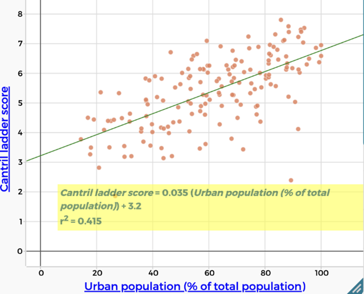 | Urbanisation There is a weak positive correlation between Cantril Ladder score and urbanisation. ($r^2 = 0.415$) People living in urban areas are more likely to report being happy. |
Ask students to identify which factors from their original brainstorm are not represented in the data and to consider why these factors may be difficult to measure consistently at a global scale.
Remind students that throughout the sequence they have used scatterplots, lines of best fit, and $r^2$ values to identify and compare relationships between variables. Explain that while these tools are powerful for identifying correlation, they do not automatically tell us why a relationship exists.
Display slide 23 of What makes us happy? PowerPoint to illustrate how two variables can be strongly correlated without one causing the other. In this example, the global number of pirates and global average temperature show a strong correlation over time, but there is no causal link between them. The decrease in piracy is better explained by factors such as changes in naval patrols, international law, and technology, rather than by rising temperatures.
Explain that students will now examine a set of relationships drawn from the data to consider:
- which relationships may involve one factor directly influencing another (direct effect).
- which relationships appear related because they are both influenced by something else.
- how other variables that are not shown can affect how we interpret the data.
Organise students into small groups. Provide each group with a set of eight graph cards from the Causation vs correlation Student sheet, each showing a scatterplot with a line of bets fit and $r^2$ value. Ask groups to sort the cards into three categories:
- It is reasonable to argue that one variable causes the other.
- The variables are related, but the graph alone does not justify a causal claim.
- There is not enough information to decide.
For every card, groups must give at least one reason for their decision.
Before students begin, explain that a good reason for accepting or rejecting a causal claim should focus on whether the relationship makes sense in the real world, not just on what the graph looks like. Some prompting questions include:
- Does it make sense that changing one of these things would actually cause the other to change?
- Having more money might improve living conditions, but it doesn’t guarantee that people will feel happier.
- Could there be other factors affecting both variables at the same time?
- GDP per capita (PPP) and happiness might be related because wealth affects things like healthcare and education, which also affect happiness.
- Is it clear which variable could come first (dependent vs independent)?
- It’s hard to tell if education causes happiness, or if happier, more stable countries invest more in education.
- Does the strength of the relationship support a causal claim?
- A scatterplot might have a high $r^2$ value, indicating the two variables are strongly related. However, a strong correlation on its own does not prove that one variable causes the other.
Emphasise that students are not being asked to prove causation. Their task is to decide whether the data and the real-world context make a causal explanation reasonable, or whether the relationship is better understood as correlation only.
Correlation and causation
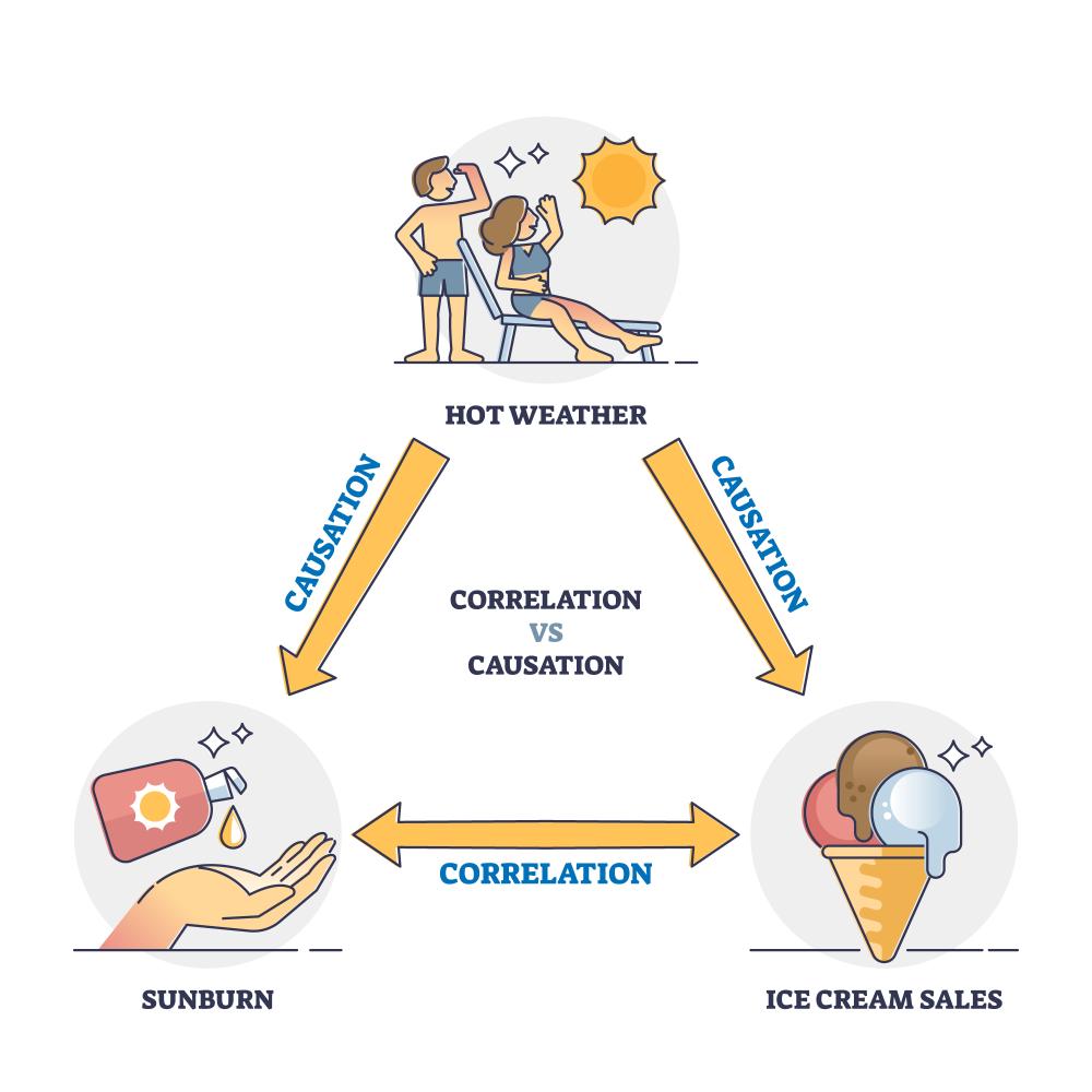
In this sequence, students have constructed scatterplots to explore the relationship between two variables, focusing on correlation. Two variables are said to be correlated when changes in one variable are associated with changes in another.
Importantly, correlation does not imply causation. Establishing that one variable causes a change in another requires more than observational data. It typically involves experimentation, controlling for confounding variables (variables that influence both the dependent and independent variable), evidence that the cause occurs before the effect, or repeated logical reasoning across multiple contexts. As a result, this sequence supports students to identify and interpret correlation, but not to claim causation.
The Australian Bureau of Statistics provides a clear explanation of the difference between correlation and causation, how correlation is measured, and why establishing causation is challenging.
Ask students to reconsider the factor that produced the highest $r^2$ value across the class.
Ask:
- Is this factor a useful predictor of happiness? Is it a direct cause of happiness?
- What would we need to know or measure to be more confident about this causal claim?
Emphasise that:
- a variable can be a strong predictor without being a cause.
- prediction and explanation are different goals.
- mathematics helps us test claims, but interpretation requires judgement.